HubSpot Mobile Team: The Mobile-First Features That Make up the Top-Rated HubSpot App
The HubSpot mobile app has an App Store rating of 4.6 and a Playstore rating of 4.7, something we’re very proud of. A lot of work goes on behind the ...
One of HubSpot’s core values is usability, of which visual design is a key component. Some of the visual design patterns we use include exposing and grouping information, allowing plenty of whitespace to separate distinct sections of data, and using indicators like icons to assist with scannability and information recognition. However visually pleasing these patterns may be, though, they are only truly successful when they help meet users’ needs. On the CRM record, we found that by overusing patterns like these we were actually perpetuating significantly slower workflows for sales and support reps who rely on speed in order to meet their competitive performance metrics.
Sales reps are evaluated by number of deals closed, the amounts of deals closed, and engagement activity. Support reps, on the other hand, are rated by average response times and tickets closed, in addition to CSAT (customer satisfaction score) and NPS (net promoter score). Rushing through their tasks can lead to sloppy interactions, missed deals, and low customer satisfaction. If these reps don’t meet their goal metrics, they’re passed up for rewards, bonuses, and promotions — or, in some cases, they could even lose their jobs. In order to provide them with a successful interface, we knew we needed to respect the time they spend on our platform and give them more control of their focus.
As a result, we’ve redesigned and re-organized almost every section of the record page to favor data density in an effort to let them get their jobs done, faster than ever.
To begin this work, we had to take stock of our current state.
In addition to more obvious data density concerns regarding whitespace and unnecessarily exposed information, we found some significant pattern discrepancies. We ran an audit of almost 40 activity types available on our record timelines — here’s what we found:
Additionally, we found some fundamental issues regarding the lack of responsiveness and low level of functionality that we were providing to our users with smaller screens. This problem was exacerbated by the 11% decline in users using desktops or larger window sizes from November 2019 to June 2020, presumably due to the widespread work-from-home catalyzed by COVID-19 shutdowns.
Standard laptop customers could only see an average of 1-3 activities on our timeline at once, and limited information on the page’s sidebars:
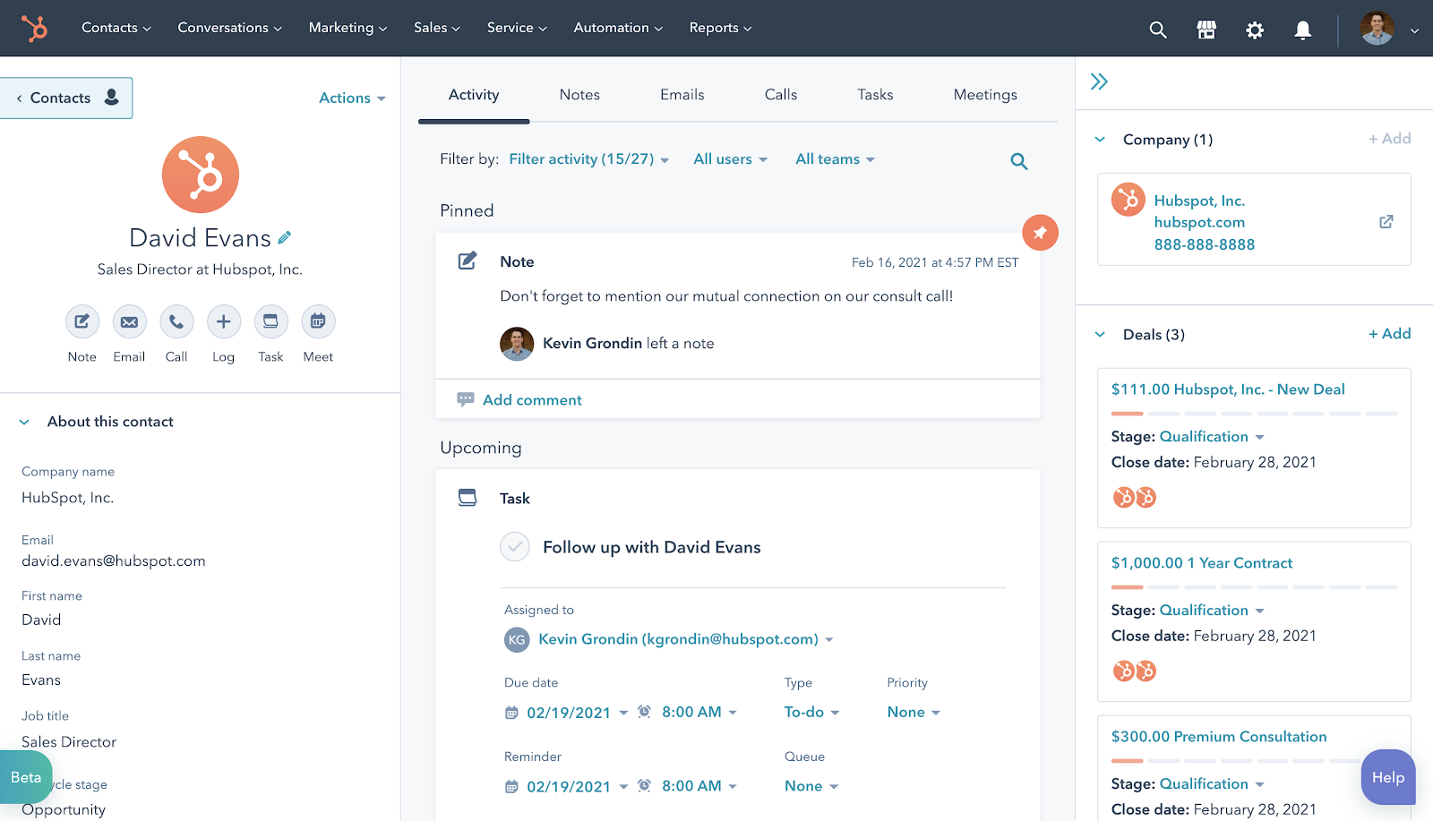
Presenting only small pieces of information at a time, including some redundant details, requires reps to spend inordinate amounts of time scrolling and processing unnecessary data. For example, it took users a median of almost eight minutes to respond to a call or email after opening a record. And for our customers, time is everything. We knew we had to simplify, reduce clutter, and reduce whitespace to speed up our reps’ workflows and let them see more at once.
Our main strategy with this redesign was to give users more agency over where they put their focus through a simpler, more scannable presentation of data with less noise.
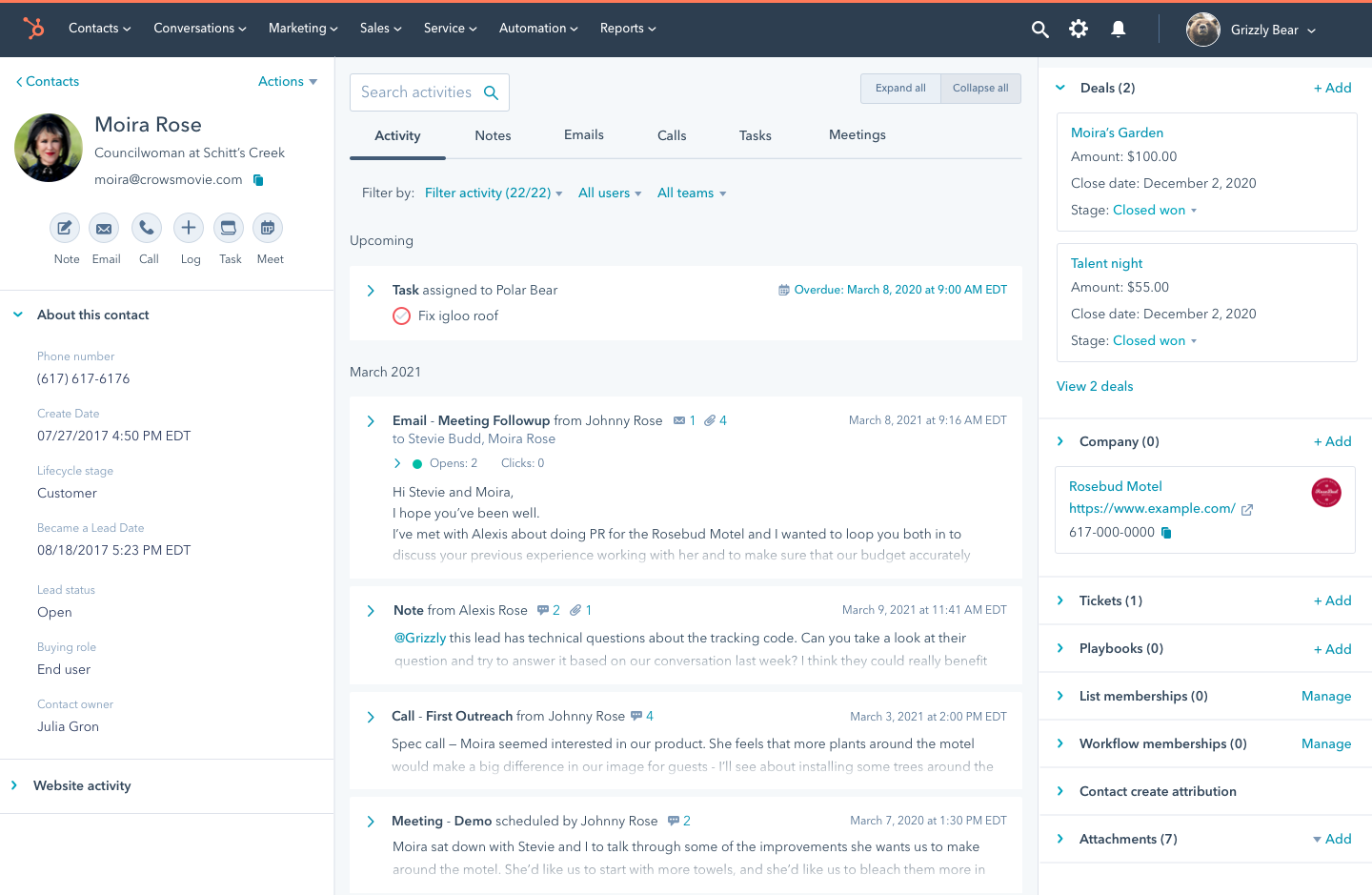
We started with our timeline. We simplified and gave each activity an easily scannable collapsed state, so that reps could survey across many data points at once and decide where to spend their time. Less time spent digging, more time spent doing.
Showing activities in their collapsed state means that customers get a dramatic increase in visible activities, especially those working on small screens. If users need more information to complete whichever task they’re working through, they can expand their chosen activity on an individual basis or expand all activities at once with a single click. To give users a more direct way of finding something specific, we moved search into an open input field and brought it up to the top left of the timeline. With these changes, we’re giving users more efficient ways to both scan for general understanding and to hunt down an exact match of what they need to reference.
In hiding the majority of activities’ body content and removing activity icons, we cleared out many differing components, controls, and uses of color from the timeline’s initial presentation so that users can keep their focus on the task at hand. Additionally, fewer uses of color on the record means that shown alerts or visual status indicators are more recognizable and hold more weight. For example, overdue task check marks are now encircled with red in their compact state and brought up to the top of the timeline in our ‘Upcoming’ section. For sales users who run their workflows based on task queues, this makes it much easier for them to recognize urgent items and prioritize their time accordingly.
Less time spent digging, more time spent doing
On the record sidebars, we found that no more than 4% of users were initiating calls or emails from association card links, so we lowered the visual prominence around that action and added quick-copy buttons to let users easily grab and utilize their contacts’ information to use in other tools. Only 2% of users were regularly expanding or collapsing the right sidebar, so we removed that functionality and gained back vertical real estate – in addition to significantly speeding up page load time. In our right sidebar association cards, we took the same action as in the timeline to take away icons to reduce noise and made further efforts to enforce consistent patterns in regard to the amount of data presented and the components used to do so.
As part of these changes, we also removed a lot of white space. We took it from the margins within and between our timeline activities and association cards. We reformatted our profile highlight cards to be left- rather than center-aligned, and saved a lot of white space there as well. We enforced consistent font sizes and weights, and in doing so also saved substantial line height.
In hiding unnecessary information, enforcing consistencies, and removing redundancies, we not only made it easier for reps to scan and action on data on the record, but also decreased load time on the page, adding up to a noticeably faster experience across the board.
Interested in working with a team that's just as interested in how you work as what you're working on? Check out our open positions and apply.