Making Security Usable at HubSpot
Security and usability have been at odds with each other since the dawn of time. We usually associate trusted software with clunky interfaces, not an ...
A few months ago, we really started to think about how we can scale our product team long-term. Engineers, designers, and product managers are hard to hire, especially ones that will raise the average of an already world-class team. A big part of attracting that level of talent is being intentional about how we tell the story of product and engineering at HubSpot. Today, after redesigning our homepage and jobs pages, we launched a new and improved product.hubspot.com. Here’s how it happened and what the redesign is doing for our inbound recruiting framework.
When Lesley, Margo, Chelsea, and I sat down for the first time to talk about the redesign, we quickly found glaring problems with our old site. The majority was hard-coded and difficult to navigate; it felt booby trapped for anyone that wasn’t a developer. Aside from being clunky, the old homepage failed to quickly answer one simple question: Who is the HubSpot product team? The subhead, “We build software to help businesses succeed”, suggested that we’re a product and engineering team, but it didn’t cover what HubSpot does or how our team is different from other development organizations. It didn’t make the case for why anyone should consider growing their career here.
We relied on a video, front and center, to tell that story and answer visitors’ questions about what we do, how we work, and what our culture is like. Unfortunately, only 11.4% of visitors were actually clicking play, and even fewer were making it past the first 30 seconds (thank you, Wistia.) So, the homepage gave visitors the option to apply for a job or read our blog without any context on why they’d want to do either. It was a dead end.
This brought us to the most important question of any homepage redesign: What did we want visitors to do when they got there? This problem, and the solutions we ultimately came up with for the homepage and jobs pages, was pivotal in pushing us to think deeper about inbound recruiting on the product team and how we could design a valuable experience for candidates and future candidates, and but also for visitors that will never become candidates.
There’s a sweet spot where employment branding and the hiring process meet. They can happen independently but there’s a 1+1=3 effect when they talk to each other. That by-product is inbound recruiting. While the website hosts our jobs pages and is a recruiting tool, we don’t think of it purely as a careers site. It’s a platform for our product team to connect with the product world at large in a meaningful way. Visitors should learn something whether they want to work at HubSpot or are happy building products at a startup out in Colorado.
We needed the homepage to reflect that mission, to balance candidate value with community value. There’s a synergy in solving for both. After dozens of mock ups, iterations, and HipChats, we built a solution.
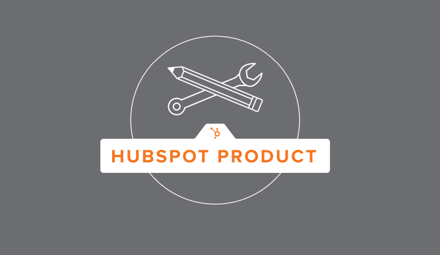
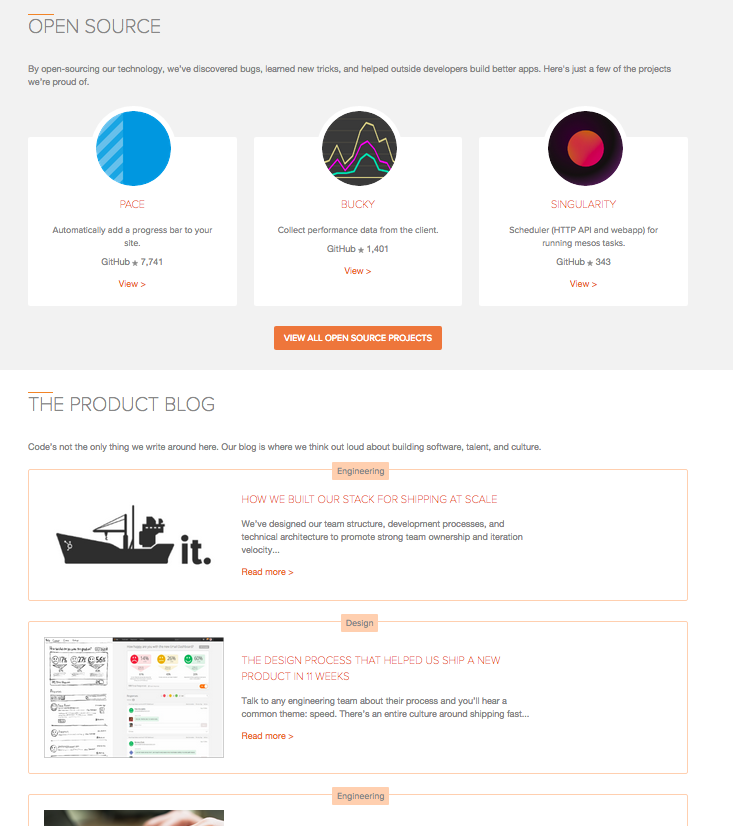
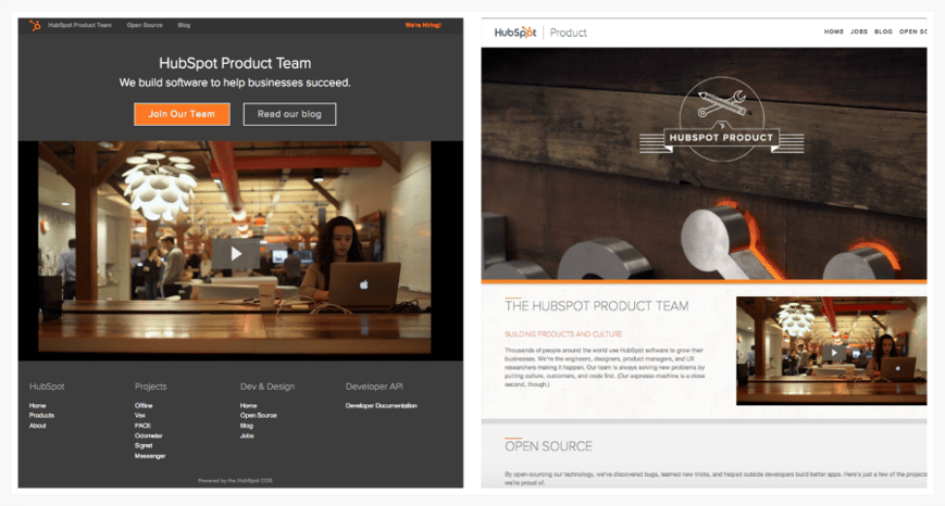 (Above: The old homepage on the left and the new one on the right. Below: Open source projects and blog posts featured on the new homepage.)
 The new homepage answers point blank “Who is the HubSpot product team?” and has a better user experience with featured content from our product blog and open source contributions. Both future candidates and visitors that will never enter our recruiting pipeline now have ways to engage on the site beyond submitting a resume. Getting that content front-and-center helps us create value for the product community and the candidate.
There’s lots to iterate on, but ultimately, the old homepage pushed visitors away. The new homepage invites them to take a step further. And in some cases, that next step is going to be to learn more about our career opportunities.
A company’s jobs pages should reflect what it’s like to work there and make it easy to apply. In our case, that meant we didn’t just need to redesign our jobs page. We needed to rethink the entire flow and experience. The first step was finding other companies whose jobs pages we admire and dissecting them. What works? What doesn’t? What’s their tone? How do they highlight talent? How many steps do you have to take before you can submit an application? What should we try to emulate?
One of the biggest discoveries, though, was what we didn’t want to emulate: a laundry list of open positions. On most sites, when you click ‘View All Jobs’, or a similar CTA, you’re presented with a scrolls-worth of specific titles like ‘Software Engineer- Design Tools’, ‘Software Engineer- Blog Tools’, ‘Software Engineer- Mobile’ etc. For those companies, this approach probably makes sense for how they hire and structure their teams. But it doesn’t really align with how we think about attracting and growing talent.
A candidate’s potential is more important than how closely their resume mimics the work they’d be doing. We’d rather hire a less experienced engineer with an unrelenting passion to get better at their craft than a senior engineer who meets the minimum and doesn’t lose sleep over improving. For us, that cultural piece holds more weight than anything and we felt that specific job listings put more emphasis on the work than the talent, which could potentially alienate candidates. (We also heard feedback that this format can be stressful for job seekers; they aren’t sure which title is the best fit for them and are wary of submitting multiple applications.)
So, we created one application (per location) for each division within the product organization: Software Engineer, Product Designer, UX Researcher, Product Manager, and Intern or Co-op. The job descriptions for each (specifically “We hire talented people at all seniority levels and work with them to shape their role”) are explicit about who should apply and how the generalized title actually solves for the candidate.
Company culture is a competitive hiring advantage. Top talent wants to work for companies that share their values, have a strong mission, and are full of bright people they can learn from. The biggest problem with our old jobs page was that it didn’t reflect what any of that looks like at HubSpot. We needed our new jobs pages to capture what the HubSpot Culture Code (new hires often cite the deck as a big factor in deciding to join our team) does: that HubSpot has an unmatched environment for growing your career.
Because culture is so paramount at HubSpot, we (and specifically our co-founder Dharmesh Shah who created the Culture Code) have done tons of thinking, both internally and externally, about it over the years. There are countless sound bites to describe our values, mission, and team. That’s why one of the hardest parts of redesigning the jobs pages was coming up with content. We didn’t want to leave anything out or miss an opportunity to share one more great thing about our culture and team. Distilling information was hard but ultimately we rallied around three key things that are central to how we build products: our mission of solving for the customer, our commitment to autonomy and speed, and our incredible team of makers.

(Above: Old jobs page on the left and new jobs overview page on the right. Below: Engineering jobs page)
 We’ve found that the #1 thing that attracts amazing people is other amazing people. That’s why the new pages feature photos of employees, what a typical day looks like for them, quotes from them about the impact they’re making on customers, and blog posts they’ve published about their work. Now, candidates can actually picture themselves at HubSpot and get a real sense of our team’s personality, work ethic, and motivations.
The site’s live and now it’s time to iterate. Like any product or project, there are tweaks, updates, and feedback we need to digest. And over time, as our team grows, our recruiting process is bound to change and require different solutions on the site. There could be an increased need for more specific title listings as our product offering expands. We will probably need a different solution for the ‘Apply’ CTAs if we start hiring for product in more offices globally beyond Cambridge and Dublin. We’re already rethinking the ‘Apply Now’ CTA on the jobs overview page to create a more intuitive path for visitors to choose which product vertical they fall under.
From the very beginning, the goal of this redesign was to build a site that reflected who the HubSpot product team is and what it’s like to work here. The new site pages capture that with good design and people-centric content, but also because they are a constant work in progress just like our inbound recruiting playbook. Both the site and our approach to attracting top product talent will continue to evolve as we learn from what works, what doesn’t, and how we can make our team more valuable to our candidates and community.