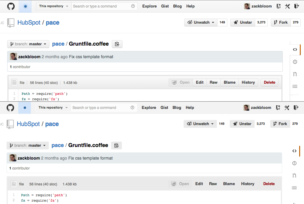
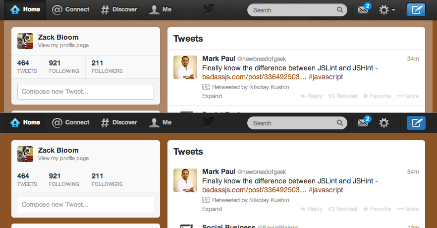
In some ways, a flat UI represents less information than one with depth. The ultimate extension of this is this quick bookmarklet which can make many websites "flat" just by adding a bit of CSS (skip down for the source):
Drag This To Your Bookmarks Bar
Some Examples
GitHub

Twitter

The bookmarklet works in part by removing background images. Websites need to define a good background color behind their images, if they don't, you might see some unexpected things:
Pandora

Source
Follow @adamfschwartz on Twitter