The Framework We Use to Solve and Build for Impact on the Flywheel Design Team
Written by Renann Devlin, Senior Product Designer @ HubSpot. HubSpot's sales team reps rely on multiple tools to accomplish their day to day ...
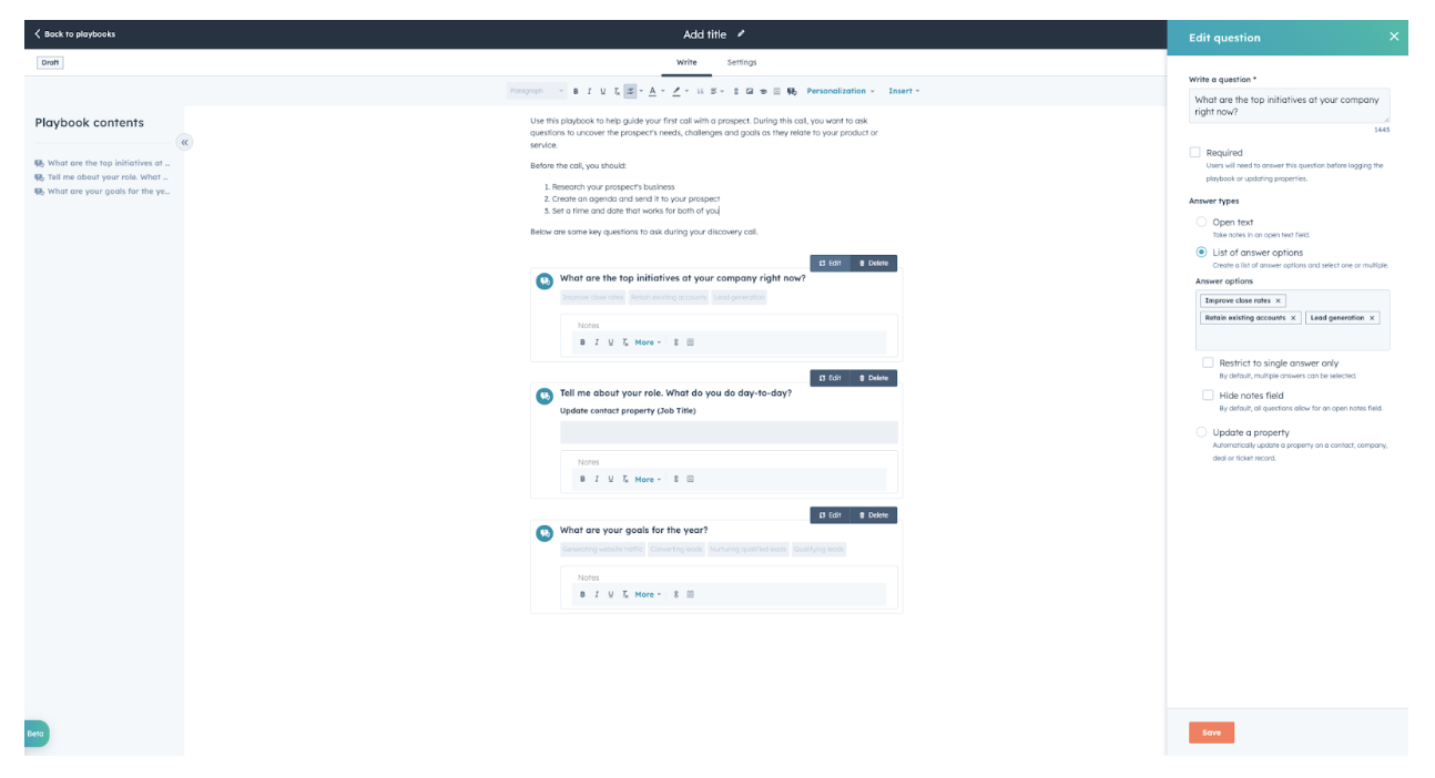
The Sales Enablement team recently made major updates to the authoring experience in Sales Hub’s Playbooks editor tool. We needed to introduce new editing features, allow the product to scale over time, and not disrupt users in their work. We’re sharing the approach we took to tackling this design challenge and usability principles kept in mind along the way.
For context, the HubSpot playbooks tool is most often used to create call scripts, sales plays, and guides. The authors are often sales managers or sales enablement professionals who create content for sales teams to consume as they are doing their jobs. Core to this product is allowing the sales manager to provide the needed content to their reps at the right time. In the words of our product manager, “We are not building playbooks, we are building a tool for users to build their own playbooks.”
The existing editor at the time allowed these authors to do basic content formatting and insert some more advanced content like questions, videos, and images. There was heavy customer demand for more robust editing features including embedded content, integrations, and more control of the layout.
The design challenge was to expand the editor to accommodate a host of new features while keeping its intuitive usability. Some of the new features we wanted to include were: inserting snippets, knowledge base articles, personalization tokens, and the ability for the author to embed more interactive sales content. We knew we'd want to grow the functionality around embedding advanced content over time, but included a few elements within the mvp (minimum viable product) to start. We needed to create an editor that incorporated all the short-term features and could grow and accommodate our backlog without having to be redesigned entirely in a few short months, causing end users to have to learn new patterns. It was important to balance releasing exciting new features with how often we changed the way things work to avoid creating distrust, disorientation, and change aversion.
What makes a good editor?
The first thing we did was dive into some competitive research. We evaluated how others were building editors and how we responded to editors in our daily lives. We all work with editors - every time we draft an email, take a digital note, or write a blog article. The first thing that became clear was the need to define a line for what kind of editor we wanted to create. My research was filled with advanced page editors, allowing the user to completely format everything on the page.
My first instinct was to follow patterns found here to give users the maximum amount of customization of their content and to give us the most room possible to grow and expand our offerings. However, after discussing initial ideas with the team and taking a step back, we had to reevaluate if our users needed, or even would want, all this customization. Certainly we had some users who had expressed interest in formatting their playbooks, but this was not a common request and was not needed to incorporate mvp features or features we wanted to add in the future. Additionally, we didnt’ want to introduce information overload and decision paralysis by giving users too much that they didn’t. So another balancing act was introduced: how much customization do they need?
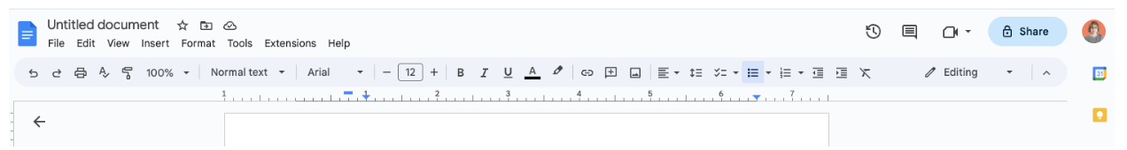
We decided that the playbooks editor is much more aligned with the way document editors work (like Google docs below), rather than full page editors. The philosophy behind playbooks is simple: content first. We did not need to give users a full web page editor with limitless customization choices. We needed to give authors just enough capability to edit the document, but not so much that they felt the pressure to make extraneous layout and design decisions. Flexibility and ease of use is a guiding principle of UX design. We wanted to account for authors who wanted to edit a little and authors who wanted to do a lot.
One of the most important tools in a UX designer’s toolkit is understanding a user’s mental model. We all have mental models of how we navigate the world and they help us make assumptions about how new things we encounter will behave. The first question we needed to answer was how do users expect to work with page editors?
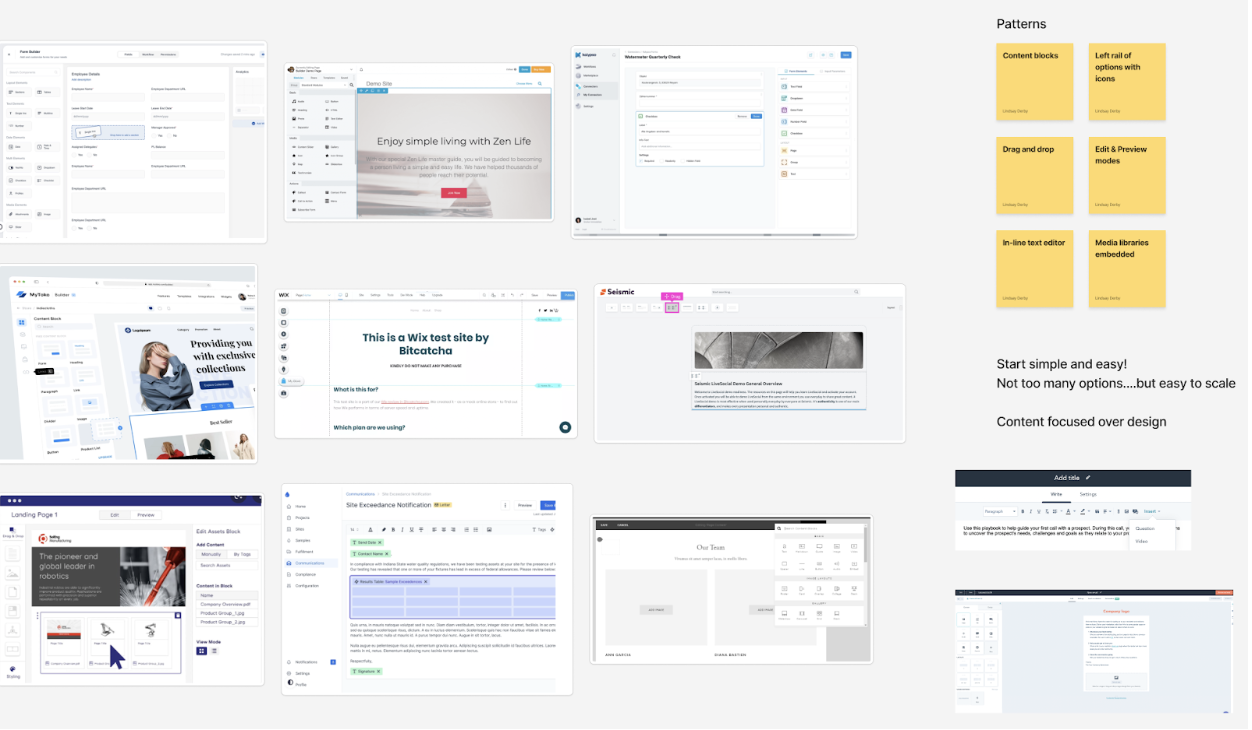
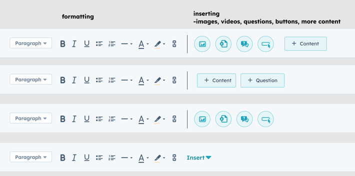
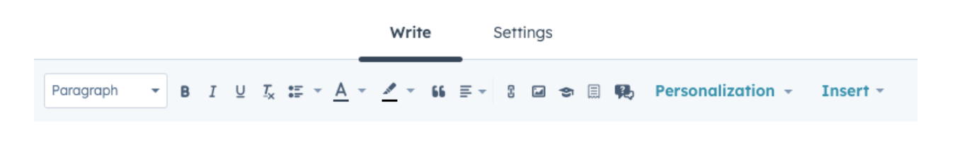
After examining the current playbook editor as well as other common editors, key patterns began to emerge. As you can see in the examples below, the horizontal editor toolbar has a balance of icons with tooltips, dropdowns to reveal more choices, and some kind of inserting behavior for media.


Most of our users read left to right, and in our editor, as well as some of the most common editors out there. The upper left option — which is likely to be seen first — offers the most basic formatting functions like typeface, bold, italic, and type size. There are also icons that are received almost universally, like alignment, bulleted and numbered lists, and the image icon for inserting pictures. Most importantly, all icons have a tooltip as we can not assume that even the most popular icons are understood by everyone. This is also an accessibility best practice.
One of the most important design considerations for this particular design was how the editors handled more advanced options like inserting content that wasn’t text-based. We saw a combination of icons used for things like media and file types and dropdown menus to open panels with lists of options. This seemed to be a good approach for our use case as we would have a combination of content that's replicated throughout the HubSpot ecosystem and some more one-off options.
Taking an IA approach
When deciding the order of things on the page, the hierarchy is important. We wanted to organize the functions available from left to right in order of usage, while leaning on the mental models established from other popular editors and how our users were used to working with playbooks today. First, we organized functions into buckets like formatting content, inserting new content, and editing content. This helped us group the functions into ways that'd make sense.
We decided which items should stay in the toolbar, needing just 1 click: the basic formatting features and the quick insertion behaviors. Editing behaviors that needed more customization would need to be opened in a side panel. This is something our authors are already accustomed to doing as this is how they insert and edit questions. A side panel experience would make the most sense for more complex new features like embedded sales content. This would also offer more real estate for scaling functionality without cluttering the toolbar.
Some things don’t fit in a nice box as cleanly as we would like. For example, the adding a question behavior is important enough to the playbooks workflow that there was a case for polyhierarchy. Given its priority, it deserves top level visibility. But, it also has advanced customization like content we intend to nest in the “insert” menu. It lives in both worlds and users may look for it in both places. We decided that it was low risk and beneficial to include it in both locations. A card-sorting activity is an excellent way to determine if a menu item should be a candidate for polyhierarchy, and as we continue to grow the editor, this research will be important to test and validate our design decisions.
Designing for scale
The designer in me wanted to delineate the types of functions into categories and assign everything an icon or a button. While this would have created an elegant solution for the features we have today, it'd have caused us more rework as we scaled the product. It is not a good user experience to load the toolbar with every feature available as it'll be cluttered and eventually we'll simply run out of room.
We could have proceeded with a design that visualized the “insert” behaviors for now and then used a dropdown menu once the list became unreasonable. We made the decision to use a dropdown menu now so we wouldn’t have to make another big change to the toolbar later and disorient users. It was important to solve today’s challenges, while also considering the challenges of tomorrow.
In the end and after much refinement, we decided to organize the toolbar into three sections:
This solution affords us the flexibility to add functions to each section of the toolbar while giving us the space to meaningfully grow new ways playbook authors can customize their playbooks. Like all things in product, the solution is never finished and we'll continue to gather feedback from users to iterate and refine the editor bar and the rest of the product to focus on the best experience possible for our customers.
Do you want to help us solve challenges like this? We're hiring - check out our Careers Page for your next opportunity! And for a behind-the-scenes look at our culture, visit our Careers Blog or follow us on Instagram @HubSpotLife.