Here’s a little story about how a product designer, Darlena Tra, and me, Ariel van Spronsen, a content designer, successfully collaborated to redesign the HubSpot content management system (CMS) domain connection flow, significantly increasing customer satisfaction scores.
The design problem
When HubSpot decided to add a free tier to our CMS plans, we realized that would introduce it to a much wider range of users with differing levels of knowledge about how website domains work. Our existing domain connection flow was simple enough for people who understand the basics of domain name system (DNS), secure sockets layer (SSL), and other technical aspects of working with domains, but our customer satisfaction score (CSAT) analysis showed that we couldn’t assume this knowledge when catering to DIY content creators or business builders. We were looking at potential for a big issue, and the writing was on the wall: it was time to redesign the domain set up flow.
Based on the CSAT findings, we identified three primary goals for our work:
- Ensure that users are getting accurate error information by improving our DNS validation system
- Reduce confusion around the steps in the connection process
- Contextualize what’s happening as users go through the process
Our process
It may seem obvious that the user experience of a piece of software is made up of a combination of both the visual form and the information within it, but it’s only been in recent years that the software industry has embraced this idea and included content in design processes. This team recognized early on that the domain connection experience was as much about the words as it was about the interaction, and quickly engaged with me as a content designer to collaborate in the design process.
HubSpot has really championed its content design (CD) practice, and we have a robust team of content designers working across many of our initiatives, but for some teams the practice is still new. In our case, Darlena had never worked directly with a content designer, and I was new to HubSpot, so there was no established process for the way we would work together. Darlena and I jumped into this ambiguity with aplomb, creating a framework for collaboration along the way. Here’s how we did it:
- We discussed the problem space together and came up with a plan of attack.
- I started with a content audit of the current experience.
- Meanwhile, Darlena sketched some ideas for how the interaction could be simplified.
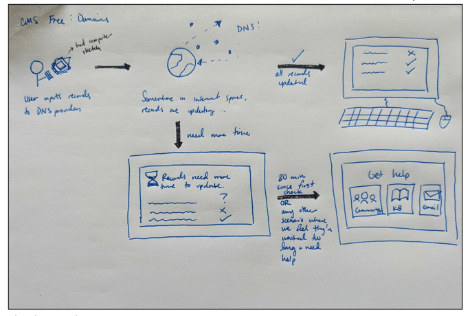 Sketch example
- Darlena updated me on her thinking as soon as she had it outlined so that I understood how it might affect content decisions.
- We met with our engineering team and product manager to walk through the results of the content audit and the initial design sketches.
- This led us to prioritize a minimum viable product (MVP).
- To that end, we agreed that not all of the writing tasks I had identified could be completed in our given timeframe, so I triaged them by the following factors:
- Whether a task would need design work
- Whether I would need to do further research to complete the task
- Whether the recommended task was crucial to the experience and/or contributing to a better experience
- The overall depth of the writing task
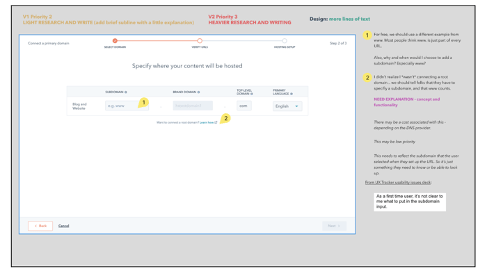 Example of annotated visual content audit with priority and task findings
Of course, the process didn’t always go exactly as planned. I came upon some hairy questions during my research and writing phases that I brought to the team to help untangle. While addressing these problems could sometimes feel like it added time to the process, we can say in retrospect that it was crucial to the success of our design. One of the biggest benefits of having content designers on a team is their ability to see and call out information issues.
An example
Before:
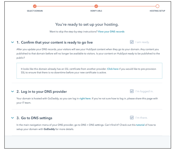
After:
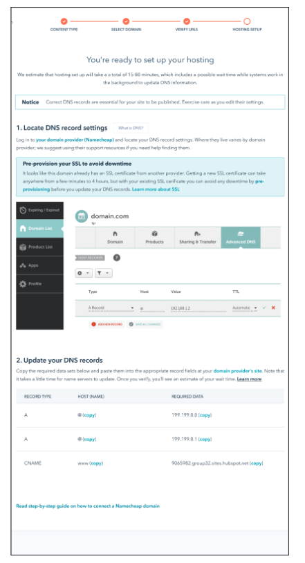
A few highlights of our improvements:
- Some users had reported that they didn’t realize they were getting into an hour-long process here, so I added messaging about how much time it will take before the user dives into the flow, setting expectations.
- Together, Darlena and I reworked the steps in the flow so that they each encompass one task and flow into one another in a way that makes sense. I also included expected time information when pertinent.
- In the previous version we gave some specific instructions about how to locate DNS records that actually don’t apply universally. Instead of saying “go to DNS > DNS settings,” I noted that location varies by provider.
How successful were our changes?
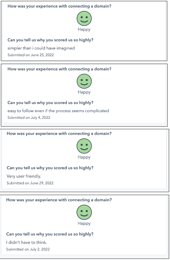
We rocked it! One month after launching the new content and design changes, our CSAT scores had increased by 21 points. 81% of respondents said they were happy with the experience. But what really let us know we had achieved our goal were the comments. Words like simple, easy, and user-friendly pepper the feedback. My personal favorite essentially expresses one of the usability maxims I come back to often: “I didn’t have to think.” (Shout out to Steve Krug.)
Lessons learned
- Collaborate early and often. We weren’t without challenges working on this project, but we did a lot of things right. Bringing the content designer, product designer, product manager, and engineering lead together from the beginning allowed us to quickly define the problem in terms of the interaction and the content, and then scope out our expectations about the work.
- You’re both designers. Content designers are often seen as writers who swoop in after the design is drafted to add the words, but as Jeffrey Zeldman said, “Content precedes design. Design in the absence of content is not design, it's decoration.” As we moved through the work together, Darlena and I both recognized the truth of that statement. We co-designed, working the process with two brains instead of one, which elevated both of our thinking.
- Get it together. One of the biggest reasons our collaboration worked was that we had a well-organized documentation set. Darlena and I worked in the same Figma file for the duration of the project. We took the time to clearly define where we were working and when, as well as how to best communicate our thinking to one another. We did run into some challenges with version control initially, but by working together (of course!), we found a solution.
- Content design is impactful. Of the changes that were made to the domain setup flow, I’d say about 20%-30% were updates to the interaction design and 70%-80% were updates to the content. This win obviously belongs to everyone on the team, but it also shows the power of content design to make a significant impact on the user experience.
Go forth and design great experiences!
I hope this has inspired you and given you some tools to deepen your product design and content design collaborations. Follow me on LinkedIn and feel free to send me your questions, thoughts, and comments there!
Interested in learning more about #HubSpotLife? Check out our careers page and follow us on Instagram @HubSpotLife.
