We've made a lot of changes inside the Hubspot product over the last year. There's been a huge push to create a more consistent and reliable foundation for all of the user interfaces throughout the product. This means attacking all of the areas of the software that exhibit similar behavior and uses, like toolbars, sidebars, footers, and so on. Ideally, these should all look and work in similar ways so that your users don't have to keep teaching themselves how to use each interface from scratch.
Unfortunately, when every interface uses the same foundational elements and copy, it can be easy for the user to lose context and get disoriented. In short, different areas in the software that fulfill different needs should look and feel different. To address this problem, we needed the content of these pages to stop hiding in the shadows and become the star of the show.
The Content Should Communicate its Purpose
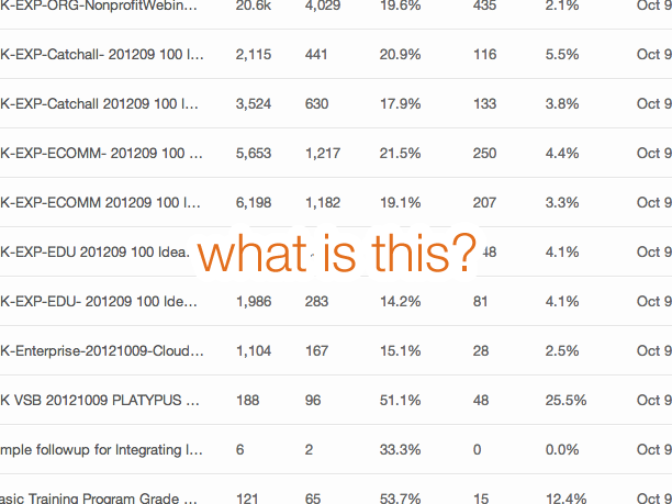
Most interfaces in enterprise applications consist only of lists of stuff in tables with columns and columns of data. Out of context, it can become difficult -- if not impossible -- to understand what you're looking at.

Many, many applications don't do a very good job of making their content sing. We realized we needed to step it up. Every piece of an interface should be dripping with purpose and should reiterate the value it can offer to the user.
Let the Content Make the Screen Special
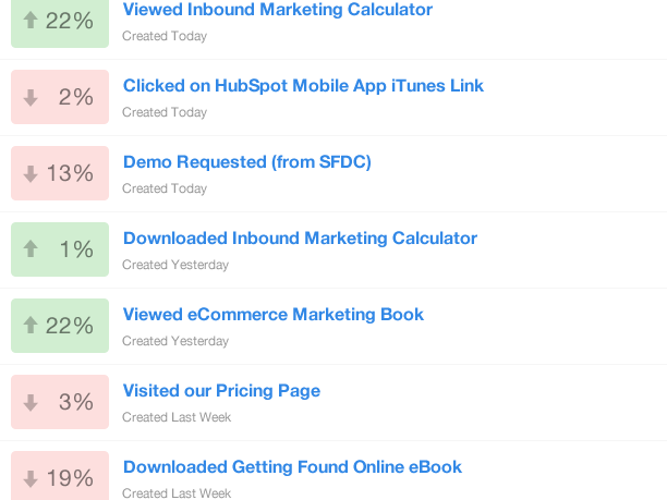
For example, if you were looking through custom event reports, you would need access to a lot of data. But mostly, you'd want know how things have changed over time. Why not visually prioritize this data and add visual signals to help identify important changes?

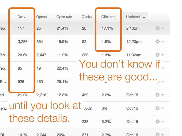
Another big problem with columns and colums of data is that many of your rows will rely on each other to provide them with meaning. For example, an email sent to a small list for a specific purpose will probably convert better than an email sent to a huge list for a general purpose. You'll need to know your delivery size to adequately understand your conversion rate.

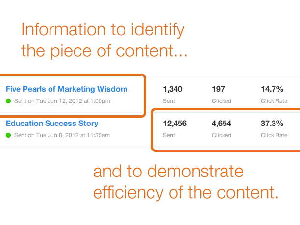
So we needed to do a better job of organizing data so that we were answering the most critical questions quickly. In a lot of applications, just finding the right object is an important task. Then figuring out what that object accomplished compared to their peer objects is the obvious next step.

Becoming More Approachable and Understandable
If we can design the content of each application to better reiteratie its purpose and to accomodate the needs of the people looking at it, HubSpot (and the world) would be a much better place. We've already come a long way in this effort over the past year, and this will remain a focus of our design work for the coming months, too. We want our software to be extremely valuable, but at the same time easy and even fun to use.
What do you do to help your content speak for itself?
