Behind HubSpot AI: How Does Prediction Engine Score Millions of CRM Objects Daily?
Written by Leena Bhandari, Senior Software Engineer, Öznur Alkan, Staff Technical Lead, Andrea Cicalese, Senior Software Engineer, and Nabeel Nauman, ...
Contacts, Companies, Deals, and Tickets are the backbone of HubSpot. They hold all the context our customers need to create great customer experiences.
With that in mind, it's no surprise that the index pages for each object are the most used pages in all of HubSpot. More than 96% of all users who enter the product on a given day touch one of these index pages. That's over seven million actions every day. On a recent call, one CEO called the Contacts index page "the heartbeat of our organization."
After a service outage last year, we took a long hard look at the performance and usability of the index pages. What we found surprised us: while our customers frequent these pages, they don't love the experience. It turns out there's a lot of friction in finding the pages and navigating through their most important features.
With that in mind, we've spent the last few months redesigning the index pages from the ground up. TL;DR: that 96% is about to get a whole lot happier.
So, what were the main reasons we felt a redesign was necessary?
To start tackling this enormous project, we mapped out every interaction flow on the pages, and identified problem areas in the design and architecture. We then combined these findings with the themes from past JIRAs and Usability Baseline Studies.
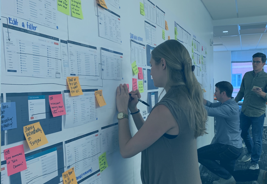
Our team at work
Once we developed the themes, we dove headfirst into different research methods:
After several months of deep research with all types of users, we felt confident that we had a firm grasp of the many shortcomings of the current index page design. The four most prominent were:
1) The information architecture of these pages was a problem
Adding a filter to segmenting the data in our CRM is an "aha" moment for our users—it enables marketers to identify new leads in the database, helps sales reps decide which leads to prioritize, and shows support reps their most pressing tickets. But we've made it far too hard to get to that "aha" moment. The CRM has been adding features consistently for years, and the current design has not been updated in the past several years to keep up with the pace of that change. The result: the page lacks visual flow, and the controls on the screen are often far from the actual objects they manipulate.
2) The layout didn't promote a sense of “my workspace”
There are very few places in the product that are truly unique to each individual user. The Contacts, Companies, Deals, and Tickets index pages are completely owned by each user. The saved views they Favorite, the columns present in the table, their default view—these things are all unique to the individual user and saved to their user settings. Because of this, users can customize their index pages to match their process and maximize their output. This is a missed opportunity: ownership and personalization lead to more in-depth and consistent interaction.
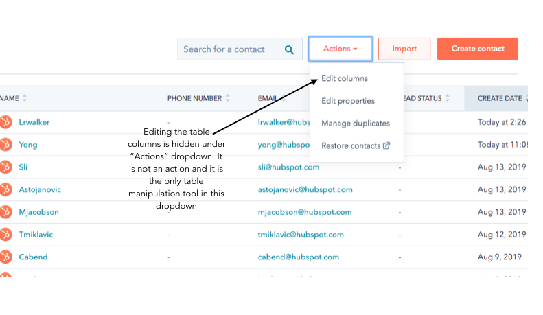
3) Index pages looked like spreadsheets, but they were missing a lot of the same "industry-standard" functionality our users learn through Excel and Sheets.
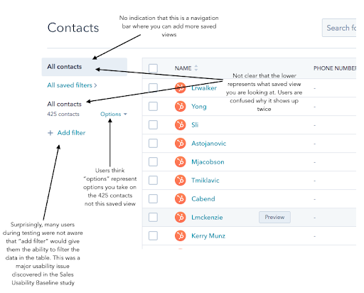
Most of our users don't get to choose to use HubSpot—leadership in their organization makes that decision. With that in mind, the quickest way for our users to appreciate HubSpot is to become familiar with our tools. When users see an index page, they see a spreadsheet. Yet our current design does not take advantage of our users’ familiarity with Excel and Sheets by incorporating spreadsheet UI patterns like tabs. I mentioned earlier that 96% of daily users interact with the index pages, but only 15% end up saving a view. Lack of familiarity is a big reason why.
4) The board and table layouts didn't match our users' goals.
Today, the surrounding layout of the board and table view are exactly the same. Favorite views, saved view library, filters—all look the same and located in the same spot. While this promotes consistency, through usage analytics we discovered that our user actions and workflow was different between the two experiences. In the table layout, users want a familiar, holistic window into all their deals, no matter the status. On the board layout, on the other hand, they want to see what's in flight, highlighting stage and motion. The new design of each layout needs to reflect our users' goals.
After spending months defining the problem, talking to customers, trying out crazy ideas, and going through multiple rounds of usability testing and iterations, we've landed on a brand new design for the index pages that we’re excited to start getting in the hands of our users.
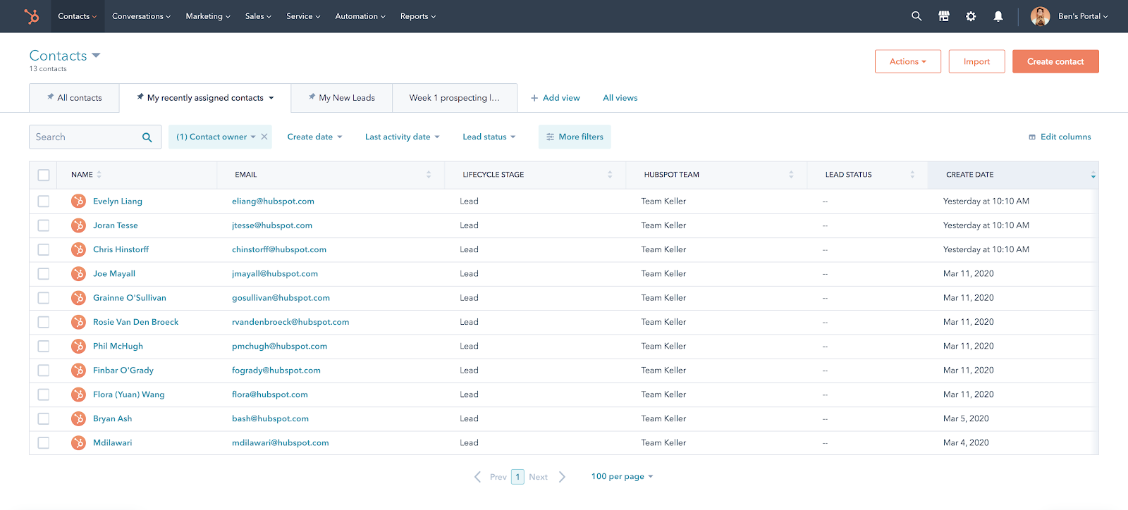
The table layout:
The new table layout aims to highlight prominent features to enhance discoverability and ease-of-use. Additionally, we incorporated common patterns found in popular software to promote familiarity. The three main highlights of the new design are:
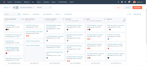
The board layout:
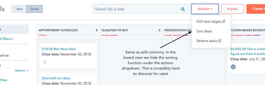
The board layout has a different design than the table layout, because our users have a different goal. On the board layout, pipelines are the most important data axis (in addition to saved views). With that in mind, the new screen puts both pipeline and saved view toggles front and center. In the board layout, we also pulled out the “Sort” and “Edit Stages” features out from behind the “Actions” dropdown. These features have significant usage among a small pool of our users, and we'd like more users to discover them moving forward.
If you haven’t already, all users have the ability to opt into this new experience. Give it a try and let us know what you think.
And if you like digging into complex user problems, using data to make decisions, or want to build product for thousands of businesses around the world, we're hiring an experienced Product Manager for our CRM.