Behind HubSpot AI: How Does Prediction Engine Score Millions of CRM Objects Daily?
Written by Leena Bhandari, Senior Software Engineer, Öznur Alkan, Staff Technical Lead, Andrea Cicalese, Senior Software Engineer, and Nabeel Nauman, ...
In April of 2020, we launched HubSpot’s CMS Hub. As the UX leader responsible for CMS Hub, I had to answer a simple question:
Was it ready to launch?
There are lots of ways to answer that question. Are the features built? Are the Services and Sales departments fully trained on the product? Is the marketing campaign ready to go? A task force of more than 20 people across all departments at HubSpot collaborated to answer this question from all of these angles and more. But even if the answer was “yes” across all of HubSpot, it still didn’t tell us if the product experience itself was good enough to launch. The features were built, but were they easy to use? Was the product delightful?
Our strength as a product organization is based on the ability of small, autonomous teams to quickly ship features. We crank out products: we launch, learn, and iterate. It’s rewarding to us and our customers, but requires more discipline and rigor to evaluate the full experience that spans across teams. It’s a conscious tradeoff we’ve made, which means we have to work harder to answer cross-team questions about quality.
With this in mind, I worked closely with our lead researcher to come up with a plan to ensure product readiness in the three months we had before launch.
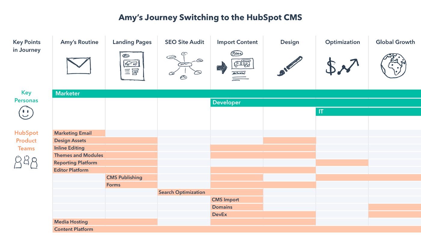
In the fall of 2019 I shared a user experience vision for CMS Hub with our product group. This visualization shows the high-level parts of the journey and how multiple personas overlap along the way. It also illustrates how 14 product teams layer across this journey and just how interdependent they are in creating a seamless, delightful experience for customers. It’s also obvious looking at this that no single team could say if CMS Hub was ready for launch or not.
We had a few months to go before launch, so we needed something we could deploy quickly. It needed to add value to teams through actionable user feedback, while also giving an ongoing snapshot of readiness to product leadership.
To address both of these needs, we came up with the idea of grading user flows. The research team would record videos of customers going through the user flows every two weeks and assign a letter grade based on a roll-up of four usability metrics: task success, number of errors, ease of use, and satisfaction.
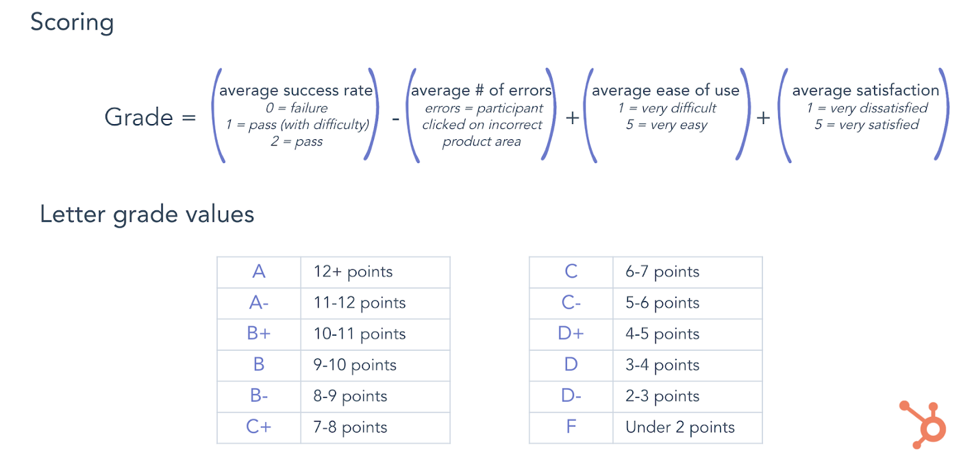
The letter grade would make it easy to report on status to leadership and see movement over time. Multiple usability metrics would give us the inputs we needed to give the team actionable feedback they could use to make targeted changes to the product.
My hypothesis was that we’d see some lower grades, some average ones, and that hopefully as teams iterated on the feedback, we’d see real usability improvements in the areas that needed it the most. I had no idea if a grading rubric would work, but figured it was worth a shot.
Choose flows to grade
The first step was deciding which user flows we needed to grade. This was easy because we already had a list of prioritized pre-launch initiatives as a group. It was just a matter of mapping to those. The flows in order of priority were:
The first flow (Building, Editing, and Designing a CMS Website Page), was designed to capture the main features we were introducing to solve the crux of marketer and developer pain with the CMS.
The second flow (In-App Marketer Onboarding), was meant to capture the experience of a net new customer signing up for a CMS trial and kicking the tires on a new website. This flow represents the beginning of onboarding for a new customer, a critical piece of the puzzle that we hadn’t included in our previous iteration of the CMS. As it stood, a customer would be unceremoniously dropped into the Marketplace (where you can purchase website templates) after signing up for a trial with no indication of what to do or where to go next. Not good.
The third flow (Web Developer onboarding), was important to get right because a foundational part of the CMS Hub strategy was attracting and growing a vibrant developer community that could build websites that marketers were empowered to easily manage. We needed a process for CMS developer onboarding in place for our launch.
Define tasks within the flows
With the flows defined, I asked the designers and PMs to define the actual tasks that would make up each user flow. There were two reasons for this:
Each flow had 3–5 tasks from start to finish. For example, there were five tasks that made up the first flow:
Watch, measure, improve, repeat
We recorded videos of customers going through each task. They were encouraged to talk out loud so we could hear their thought process as they went. This was an example of basic unmoderated usability testing. After completing each task, they gave a rating on how easy the task was and how satisfied they were with the experience on a five-point Likert scale, with the option to comment further.
Researchers made a judgment call for each user on whether they completed the flow successfully, completed it with some difficulty, or failed to complete it. They also watched for errors, like a user clicking on a module when they were supposed to be finding drag and drop handles instead.
After task success, number of errors, and the self-reported measures were captured for each flow, we put out a report. Teams then took the feedback and translated it into GitHub issues that could be worked into the product for the next round of grading.
This was the first time we had measured user flows like this. So we didn’t have a baseline to know what was a good or bad grade, and how changes to the product would impact the grades. Before we could set target grades we wanted to aim for, we needed a couple of rounds of results to see how the grading mechanism was working. We didn’t want it to be too easy to get positive results. We also didn’t want it to be too difficult to improve grades.
While there were only two groups of users, this gave us enough confidence to know that the grading mechanism was reflecting reality enough to make it a useful tool. At that point, we felt comfortable setting targets for which grades we wanted to aim for by launch. Without targets, we’d be making improvements but wouldn’t know what we were defining as “ready.”
I set targets by socializing with teams and then sending out a memo to the group. One main reason grading flows was effective was that as group leads, we tied these usability targets to official milestones on our roadmap. In addition to the outputs being actually helpful to teams, tying usability measures to a group milestone was another key lever.
I set the target for the first flow as a B+ with a stretch target of A- and the target for both the onboarding flows as a B- with a stretch target of a B. Across the board, ease of use and satisfaction scores needed to be 3.5 or higher. Any user errors subtracted from the score and brought the letter grade down. Anything less than a 2 for success rate meant there was some difficulty in completing the task, also bringing down the letter grade.
We aspirationally set the bar high, stating that in addition to the letter grade hitting a certain target, we wanted to see a perfect average score on a success rate of a 2, with no difficulty from users in completing any tasks in the flow. Our rationale was that this would prevent flows being too heavily weighted on users giving positive self-reported ratings.
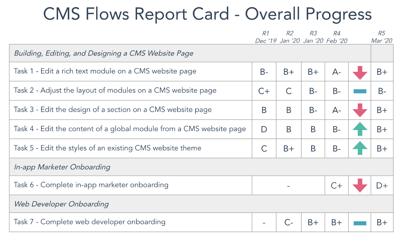
After five rounds of grading, we hit most of our targets and made significant usability improvements across the board. In-app Marketer Onboarding ended with a D+ but the key task in the flow that needed to be great for launch landed at a B which was on target. More on that below.
The biggest gains were early on
The most notable jump on the first flow was on Task 4 (Edit the content of a global module from a CMS website page), going from a D to a B. The design changes that caused this big improvement were planned on the team roadmap, but engineers jumped on it to prioritize between rounds of grading.
The Web Developer onboarding flow made a big leap early on from a C- to a B+ and stayed steady through the remaining rounds of grading. A big insight was just how much small changes to developer documentation can make a huge difference. For developers, documentation is a product. It’s what they rely on to get set up and understand how the system works. So in addition to improving that onboarding experience, grading this flow also placed the importance of documentation in the spotlight.
We missed some of our targets
We were shy by one letter grade on Task 2 (Adjust the layout of modules on a CMS website page) of the first flow. This task was aimed at the drag and drop usability for websites. We made steady progress in usability improvement through round five, but I knew this would be the hardest one to move. We saw some issues with drag and drop discoverability that the research team recommended we dig into further with different research methods.
The In-app Marketer Onboarding flow stands out as the lowest grade with a D+. That doesn’t look good. But if you look closely at the grades for each task, it tells a different story.
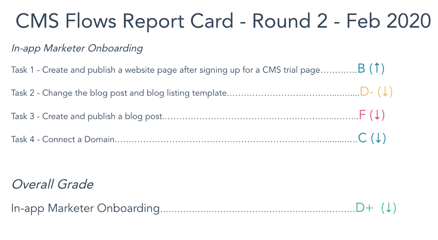
The most critical task for launch was Task 1 (Create and publish a website after signing up for a CMS trial page). We ended with a B on that flow, which hit our stretch target for onboarding. Instead of getting dropped into the Marketplace with no direction, you can now sign up for a trial, pick a beautiful website theme, and start editing a page in a few quick steps.
The grades that really brought the overall flow grade down were Tasks 2 and 3, which were aimed at the Blog and got a D- and F respectively. Yes, it’s possible to get an F with this rubric. While Blog wasn’t our priority for launch, the team responsible for onboarding included them to get a baseline, since we knew these tasks were stumbling blocks, and are part of overall CMS onboarding long term.
While these grades are low, this is a great example of using usability measurement as a source of leverage. The team knew flow grading had great visibility, so they used it to move forward the conversation on how we would fix these parts of the experience. Teams worked together to fix the low hanging fruit we could before launch, while also clarifying what structural issues we’d need to address post-launch. Flow grading for Blog came up in several conversations in the product group as we talked about who would own Blog after launch and how we’d tackle the overall user experience.
About setting targets
Making a perfect average task success score of 2 an added requirement in addition to hitting certain letter grades was too rigid. By that standard, we only hit a couple of our targets. But what we saw is that all but one user could pass without difficulty, and because one user had some difficulty, the task wouldn’t get a perfect average of 2. This was the first time users encountered these tasks, so no difficulty at all in completion from any user was unrealistic.
In the end, we decided we were ok without a perfect task success average, as long as the letter grades were where they needed to be. In order to get a letter grade in the target range, the success score still had to be high and errors had to be low, with qualitative measures in the 4 to 5 range. That kept the bar high with users feeling good about the experience.
About handling missed targets
When I set target grades to hit, I wanted to make sure we defined what would happen if we didn’t hit our targets. Otherwise, I worried that the grading wouldn’t have any “teeth” and successive efforts wouldn’t mean as much. We agreed as a group that if any flows or tasks didn’t hit our targets, we’d keep grading them until they did.
What we found is that in both cases of missed targets, we had learned everything we could from the flow grading method, and would need different research methods to dig into both drag and drop discoverability and the UX of Blog. Of course, the grades and targets are only a means to an end. And as I covered earlier, we were happy with the actual usability improvements, and launch readiness was still the outcome we achieved.
About the process
There will always be more to do to improve usability. The main limit of this approach is that like all usability testing, it’s not a realistic scenario. The users that went through these linear flows weren’t actually under pressure to launch a new website that would generate more leads for their growing business.
That said, this was a successful strategy for us and one example of how to tackle the hard problem of improving usability across the user journey. Most importantly, we launched a much more polished product than we would have without this approach. We were ready for launch.
This article original appeared on Medium.
Interested in UX positions at HubSpot? Visit our HubSpot Product Careers site.