Do you know if people are using your product the way they say they do? Especially at scale, customer interviews and usability tests aren't enough to answer this question. You need to see what happens in reality, which should be well reflected in your usage numbers.
Whether you are building a tool from scratch or have been focused on a mature product, you should have the analytical foundations to uncover problems through data.
Plan for the future by anticipating the questions that will keep you up at night when usage decreases, customers churn, or NPS is low. We talked to our own growth & analytics manager, Daniel Wolchonok, and asked him to for some tips on digging deeper to the root cause of user behavior.
1. Are your usage tracking events instrumented properly?
Ensure that your team is tracking the important stuff. This step is easy if you are starting a product from scratch because you will need to track most things. If you have been working on an existing product, make a list of the actions that should be tracked, check if they are, and ensure their names are consistent and discoverable. Tracking key components correctly will help you build the foundations of the AARRR framework (acquisition, activation, retention, referral, revenue).
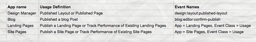
No matter how you are keeping track of events, an audit of what you currently have and what you wish you had is a good idea. Consider grouping specific events into classes - for example, a "view" class can reflect landing on various pages and a "usage" class can include creation, deletion, copying, and other actions. Here is an example of how you can structure that audit:
Tools like Mixpanel and Amplitude can help you identify the best way to fire an event, pass it over, and access your data on an ongoing basis. Regardless of the tool you decide to use, ensure it's easy to see your data and ask questions of it.
A few years ago, all of HubSpot's usage tracking was done by making SQL queries, and it took our product managers much longer than necessary to answer simple questions and uncover insights.
The more difficult accessing data is, the less you will do it.
In addition to the actual usage events, think of what data you will need in order to segment stuff in the future. Nothing is more frustrating than to forget these attributes, see a problem, and not be able to dig into which users have the issue.
The channel from which a user came from (social, paid, referral, search engine, etc.), what type of product they signed up for, and if they are a trial user are all examples of attributes you might be interested.
Here at HubSpot, we often look at trial users separately from paying customers or we segment users based on whether they are engaging with our sales products or marketing products. Inevitably, the data looks different when you can break down your install base effectively.
2. How many people use your product weekly?
Not all user actions are created equal, so you need to identify which ones actually mean usage (and not just clicks or views that don’t bring value to users but are necessary to get to the value). For example, leaving a comment on a blog post is a meaningful usage event, but collapsing the comment - not so much. Once you have identified these meaningful usage events, track the number of users who perform them on a weekly basis.
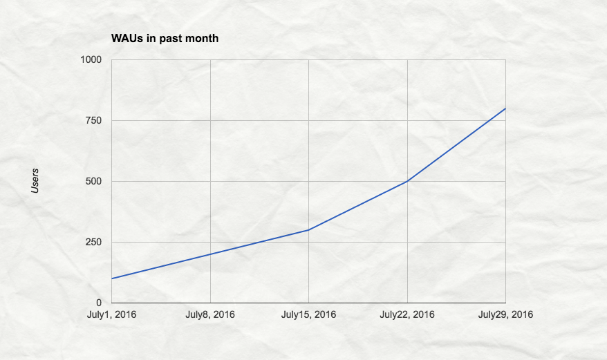
Monitor your Weekly Active Users (WAUs) to see if this number is growing or decreasing and at what rate. Having such a graph will help you see changes that have happened and give you ideas about how you can affect change in the future. (When running this report, make sure you exclude any internal users.) Here is an example of what the line chart may look like:
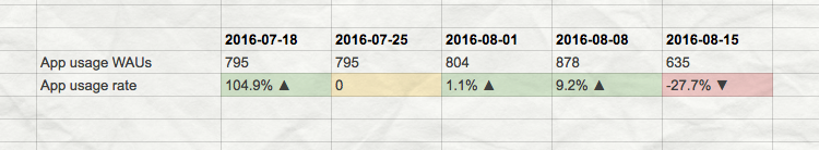
Even better, you can export this data and monitor the rate of growth of your WAUs and focus on that number. In the example below we see that there was a drastic increase in users into the 18th of July week (104%), but then we stayed flat for about week. You can use these changes in the WAU growth rate to confirm that something like a product marketing push or releasing a product to new users was as successful as you thought it should have been.
This data shows the general usage volume of your app, but it's a pretty generic number. As Jonathan Hsu, the Head of Data Science at Social Capital explains, such number needs to be further broken down into brand new users, retained users from previous weeks, and resurrected users.
For example, if we were to take the chart above, 804 people used the tool in the week of August 8th and 878 used it the week after. So there was a 9.2% growth there, but we can’t be sure what the attrition rate was. Maybe only half of the 804 users came back the following week and we got half as many brand new users. This would be a bad drop-off rate and indicate that the tools aren't truly valuable on the long run. That’s when you need to look at a retention report and what different levels of growth mean.
3. How many people are coming back to your app?
Even if you have a good handle on your WAU growth, you need to know if the same people are getting value from your product or if they actually churn pretty quickly. When do they drop off? Is it a natural drop-off as a result of people who decide the product isn't for them or go out of business, or can you improve the usability of your app to make the experience delightful in the long run?
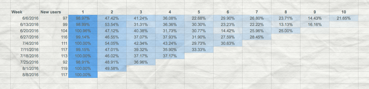
A retention chart shows you different cohorts of users and how many of them come back to perform a specific action (or just use the product) again and again. In order to build a retention report, you need to have some event that represents a cohort. Otherwise, it’s hard to truly have actionable cohort data that you can track over time. Signup isn’t a great identifier for a cohort since many of your signed-up users won’t activate. Prioritize putting in an activation event so you can do retention off of it. Here is an example of what a retention report may look like:
There are three directional ways to read the chart. You can read it horizontally and you will see that ten groups of users started using a tool in 10 consecutive weeks. Of the first group, the one with 97 users in its cohort, 47% of users returned to use the product again the following week. In the third week, 41% of them, and so on. So looking at it horizontally, you recognize the opportunity to grow the number as much as possible or at least keep it flat.
Another way to look at the chart is vertically. That will show you trends of how you’re doing at a point in the lifecycle of a cohort. Even if you increase the number of users in the cohort, like the chart is showing for the following weeks, the retention in the second week should keep growing. If you changed your onboarding, you'd expect increased retention in the first week(s) as people understand your product more.
A third way to read the graph is diagonally. This way you’ll notice things that are points in time - holidays, maybe a campaign to win users back, an email blast, etc.
In this specific case, we are going to focus reading the chart horizontally because that drop-off over time is worrisome. In week eight, only about 20% of the users who started using the tool stuck around, so we need to understand why the drop-off is occurring and what can reinforce the long-term value.
Of course, we if grow the numbers from week one to week two we will also see a huge spike in usage throughout the user's journey with this tool, but if eventually the long-term value is missing, they will abandon the ship.
4. What are your most and least popular events?
You should know what folks are doing the most in your app and what they are doing least. Not all events are created equal, so it may be absolutely fine that one event is triggered by 100 users and another by 1000.
Understanding common and uncommon events can help inform product decisions in the future such as designing a great onboarding experience. Often times, you may be surprised to find a specific event getting more traction than you thought it would or the reverse. You can visualize this in different ways, but I use a line chart over time like this:
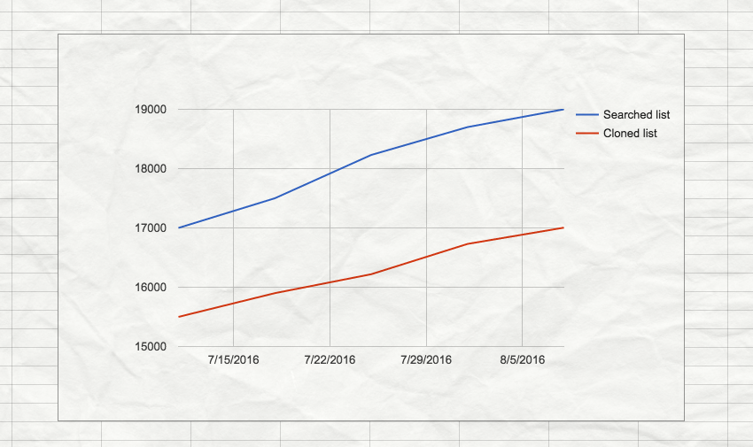
The surprising bit about this specific graph is how popular the action of searching in a list is. Surprises like this reveal opportunities: given that searching is more popular than anticipated, would it maybe make sense to invest in making it easier?
5. Do you have funnel reports for common user flows?
By now you probably have some solid expectations of how users interact with your app. For example, we knew that our users often need to search for specific contacts in a list in order to double check their logic, troubleshoot, and narrow down criteria. Knowing from the graph above how popular that action was, we assumed we'll see the same trend on our main page of all contacts where we offered an advanced search option.
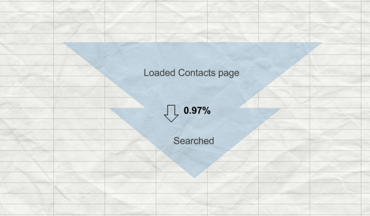
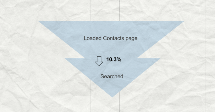
Yet we found that wasn't actually what was happening. We already had a hunch around the difficulty to search on that particular page, but were able to validate that hypothesis by looking at a funnel of events. The example below shows that less than 1% of the users who landed on our contact page were performing an advanced search.
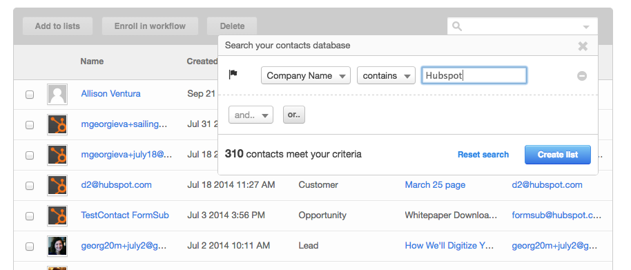
Our guess here was that users would derive value from this action but it wasn't easily discoverable due to the way we presented it in the interface. That was also the sentiment a lot of internal folks expressed and was reflected in support cases. So we dug into a redesign to tackle this problem as well as a few others and ended up with this version of the page:
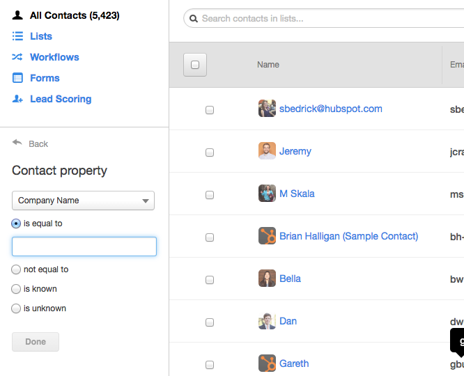
After the redesign, search was exposed a lot more, resulting in over 10% of users performing a search on the same page.
This is a very tangible way in which funnels can help you see whether usage data confirms your expectations and what users are saying, or contradicts them.
Another way that you can double-check if the usage data matches your expectations is by seeing what activities your most engaged users are performing. Our advice here is to create a trend report of weekly events, break them down by user, and sort by whom performed the most events. Once you find these users you can also use this group for user testing or customer interviews to identify an "Aha! moment" and design around achieving that sooner. We cover this approach in a lot of detail in this post.
Start with these five components to build the analytical foundation for the future of your app. They will support you in making a lot of decisions and staying on the path of increased usage and success. Let us know how it goes and what you find.
A little more than a year ago we realized that HubSpot’s application performance was impeding our users’ ability to complete basic tasks. A s a SaaS ...