How and When to Work with a Content Designer
A guide for product managers, engineers, and UXers.
As one of the newest and least-understood UX disciplines, content design is sometimes considered an afterthought, a luxury. The commonly held assumption is that nobody actually reads any of the words on the screen, so why bother? This assumption isn’t necessarily entirely false. In fact, Nielsen Norman Group estimates that people probably read only 20-28% of the words on any given webpage.
At HubSpot, we actually translate this finding into a rallying cry for why content matters so much. If people are only reading 20% of the words, it's all the more important we use the right ones. We have such a limited number of words in which we can get the meaning and message right.
So as content designers at HubSpot, we’re constantly reviewing qualitative and quantitative data for any indications that our content is not meeting our users’ real needs. Once we identify a potential problem area, we'll write new content that we think would better serve our users, then test it to see how it performs. Along the way, we’ve learned that even a few words can have a huge impact on user behavior.
Here are three instances where two sentences (or fewer) have made a big difference in the HubSpot user experience.
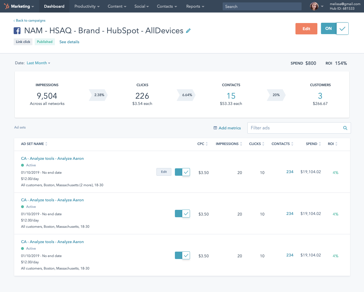
HubSpot users can create Facebook, Instagram, LinkedIn, and Google ads right from their HubSpot account. They can see how well their ads are performing on their HubSpot ads dashboard. This dashboard features a table that shows a handful of metrics customers tend to want to see most, and there’s a small “Edit columns” text link that lets users customize the metrics this table shows as their needs and preferences change.
The problem was that even though this ability to edit the ads dashboard has existed for a long time, some users didn't see it, and they were understandably unhappy that (as they thought), the ability to customize their experience was missing. We also saw that sheer engagement with the “Edit columns” link was pretty low. This led us to believe that the copy in the text link simply wasn’t clear.
To better emphasize what our text link actually lets customers do, we decided to try changing “Edit columns” to “Add metrics.”
After two weeks, the results were in. By changing “Edit columns” to “Add metrics,” engagement with this link increased by 41%. Now we’re finding that our customers have a much better understanding of how they can edit their dashboard table. More people are using the customization feature, and more users are happier with the tool, because they're using it to its actual potential. So that's a win in our book.
When people go to the HubSpot pricing page, they'll see a row of “Talk to Sales” call-to-action buttons (CTAs) for the products they can only purchase by speaking to a salesperson first. Not every product requires speaking to a salesperson, but some do. While there’s nothing wrong with this straightforward CTA, we noticed in user testing that the language was rubbing some people the wrong way. After all, "talking to sales" is rarely a user's ultimate goal. What they really want to do is learn more, get more information about the product, weigh their options, do the research they need to do before they can decide. They don't want to "talk to sales" as much as they want to build their own expertise.
To better convey this idea that users will get truly useful, helpful information from our salespeople and not a high-pressure sales pitch, we decided to test changing “Talk to Sales” to “Talk to an expert.”
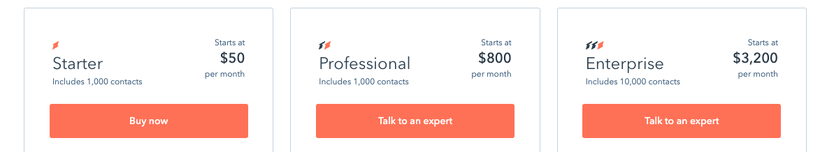
After a few weeks of testing, the data on whether users were more likely to click “Talk to an expert” or “Talk to Sales” never hit statistical significance. In other words, the results of our test were inconclusive.
However, we know that the impacts of copy changes can sometimes extend beyond the first click, so we wanted to look further down the funnel to see if there was any other sort of impact. For this particular test, that meant not only looking at how many people clicked the CTA, but also how many of those people actually went on to book a meeting with our salespeople. In doing so, we found that users who clicked “Talk to an expert” were 22.15% more likely to actually book a meeting with our sales team than users who clicked “Talk to Sales.”
In this case, by changing the copy, we didn't change the number of people who clicked the CTA. But just as talking to sales isn't the real user goal most of the time, clicking a button isn't our own goal, either. But by making this small change, we encouraged higher-intent users to pursue a conversation with sales, which gave more meetings to our sales team — all from changing two words.
When new customers sign up for HubSpot, we ask them to provide their website URL. The problem was that 21% of people who started our signup process gave up when we asked for this information.
Our hypothesis, based on what we saw and heard in user testing, was that people had a lot of anxiety around providing their website URL. Specifically, some people thought our sales team would contact other employees at their company to try to sway them to use HubSpot. We, of course, would never use our customers’ data to do such a thing. We ask for their URL truly so we can give them a more customized experience once they're logged into the product. That's it.
To put people's minds more at ease, we decided to clarify this through helper copy. Right below the field where we ask users to enter their URL, we added one simple line of copy saying, “This is between us. We won’t reach out to anyone else in your company.”
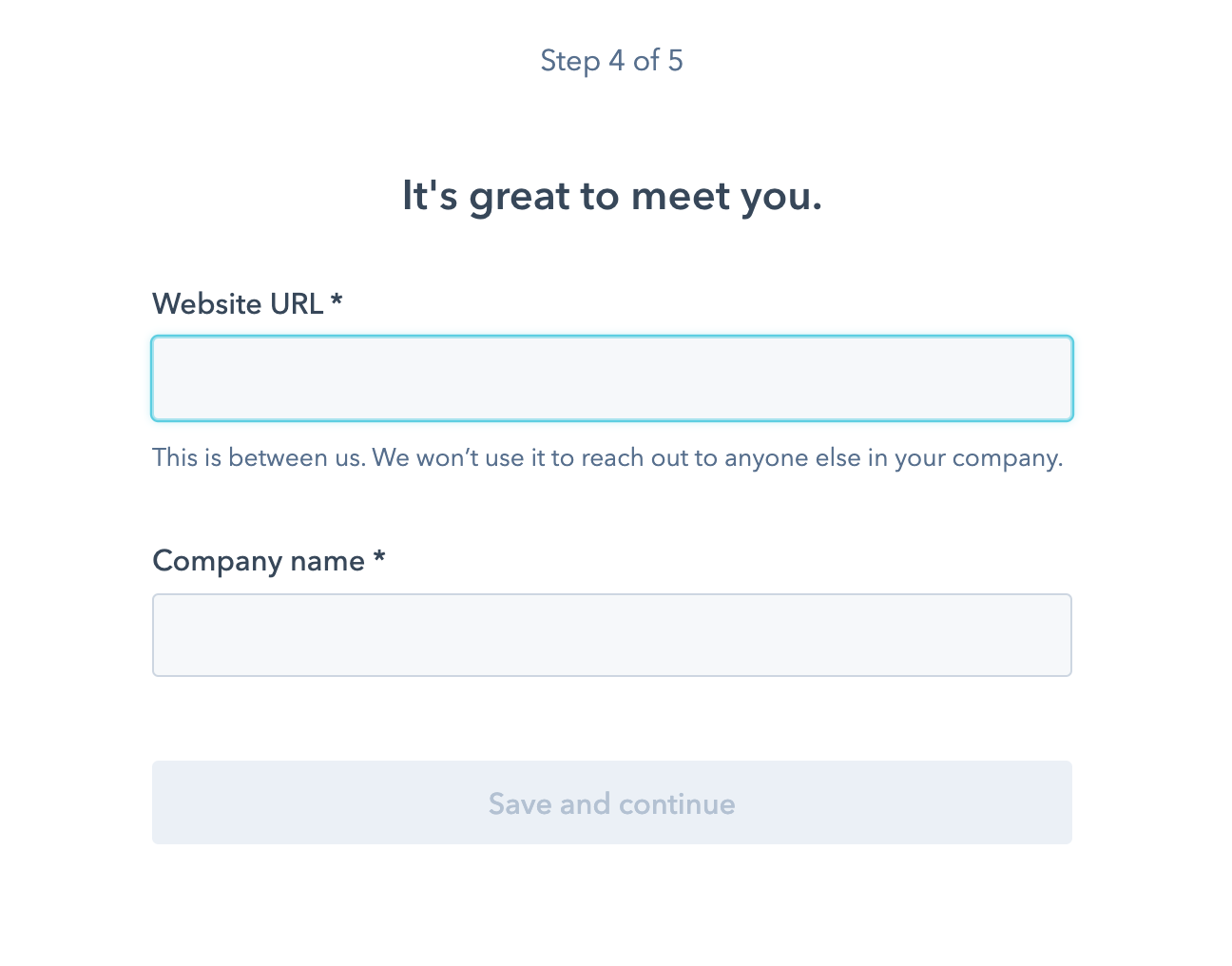
This test ran for two weeks. When we checked the data, we saw that signup completion increased by 1.6%. While that number may seem small, it means we’re bringing in a significantly higher number of new signups to HubSpot every week thanks to two powerful sentences.
These three tests were conducted on different types of copy on different areas of our site, but they had a lot in common. In each test, qualitative or quantitative data showed us that our copy was causing a customer problem. We were able to quickly iterate on that copy to make it more customer-focused. This, in turn, gave us happier customers and a better product experience.
Content matters, and whether it’s one word or one paragraph, you should never underestimate the impact it’s having on your customers.