Microcopy: The Voice of your Product
Microcopy can make or break your product's user experience. Good microcopy goes beyond just telling your users what they need to do to make your ...
Notifications are all around us — we interact with them every day. They're how we get the right information at the right time, and for HubSpot customers that's no different. We deliver an average of 6.8 million notifications to customers every single day, so every tiny improvement goes a long way to improving customer experience and satisfaction. This time around, though, we're not talking about a tiny improvement, but a huge one.
Up until recently users struggled to find and understand their notification preferences. We analyzed the data, and through design iteration and experimentation, allowed users to find their preferences at a 95% higher rate and update their preferences at a 9.16% higher rate. Read below to find out how we got there.
When I first joined the Notifications team, my first 30 days revolved around understanding customer pain points. So I did what all product managers love to do: I went through 400 support tickets to identify the main pain points our customers were facing when it came to notifications.
Quickly the picture became clearer. Most of them were related to the notifications preferences page and indicated discoverability as well as usability issues.
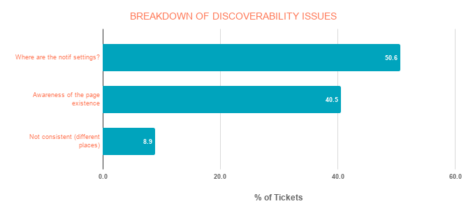
To be more specific, most users didn’t even know they could change their notifications settings, and those who knew they could do it still didn’t know where and how to do it.
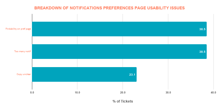
Even when they knew where to go, it was impossible for them to find what they were looking for on that page for a few reasons:
Hear from Pearly firsthand about how she and her team members solved for the customer.
In order to fix the discoverability problem, we thought about moving the notifications preferences page under Settings, as is the case for almost every other platform or app in the world. To validate this, we conducted a concept test with customers based on one of our product designer Lara Tacito’s proposals, which introduced designs meant to improve discoverability and usability.
During this research we were able to validate that customers expected to find their notifications preferences under Settings and we were able to validate the usability issues we’d identified in the support cases analysis.
Then our product designer Thomas Castro revisited the whole information architecture and layout of the page and came up with some designs that we tested during usability research. The goal of this research was to test the usability of two design prototypes by asking general questions to understand participants’ mental model and comprehension of the page (information architecture, findability, copy and labels, delivery methods, etc.). Once they were on the page, we asked them to perform five tasks to test the usability of the design.
The final prototype was 25% the length of the original page!
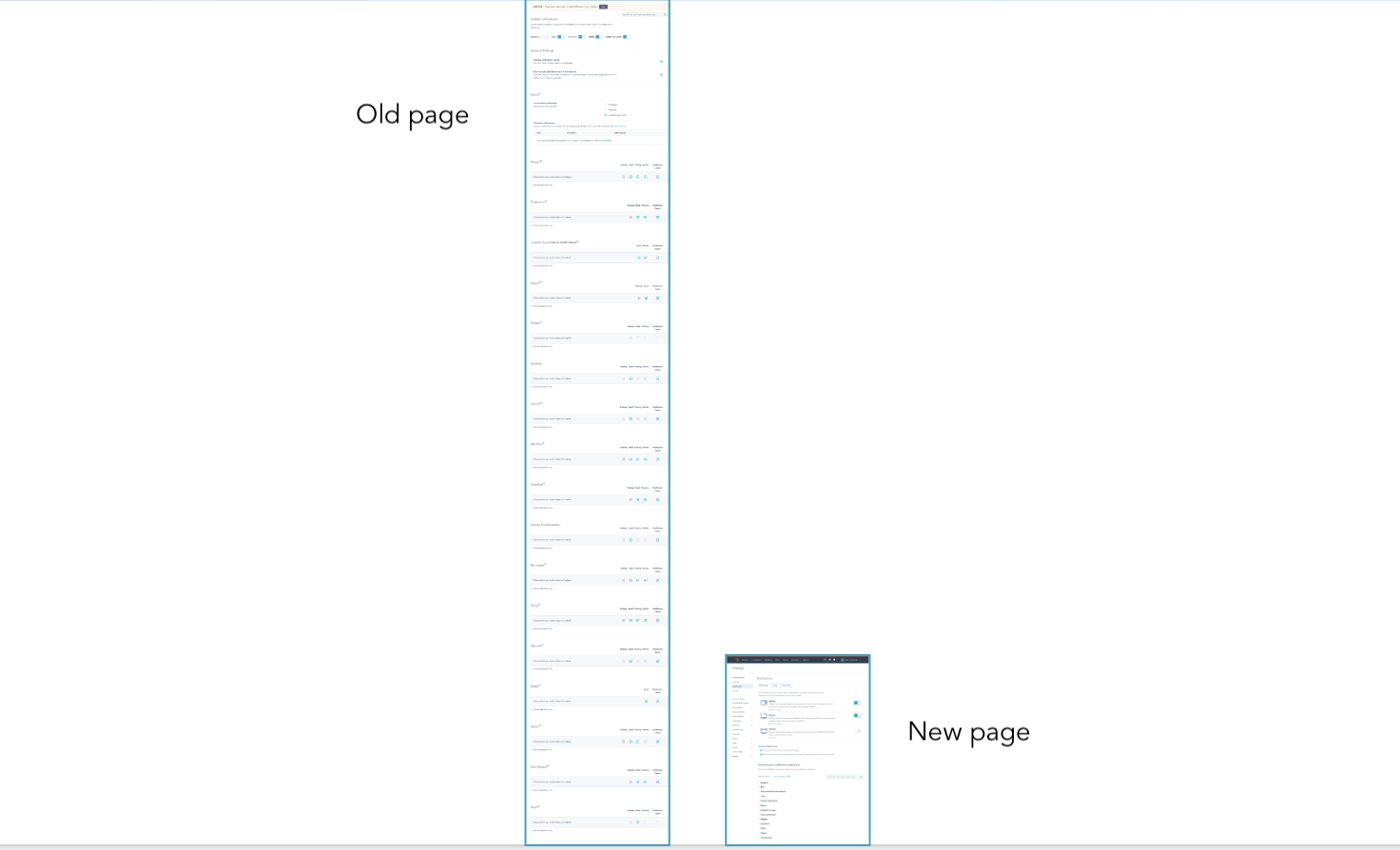
The old page and new page length when all accordions were closed.
We also worked with UX writer Natalie Rohrer, who did an amazing job to make sure we had a really clear copy for users in the delivery channels, the notifications categories labels, and the actual notification description. In addition to that, the product designer organized a card sorting exercise so we could have a deeper understanding of how users categorized and grouped different types of notifications together.
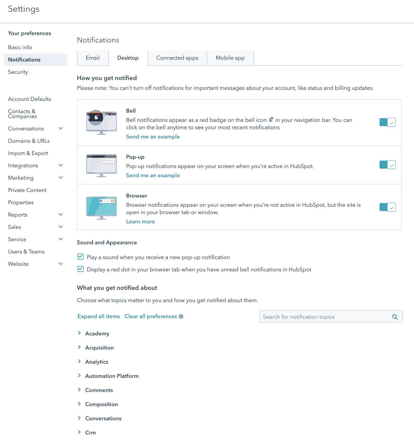
Here's what the current page looks like:
To measure our success, we established some key performance indicators (KPIs) to track:
Qualitative metrics:
Quantitative metrics:
Everything was ready, but before launching the Beta we wanted to make sure our new design would truly have an impact on customers, besides the fact that it looked better and it followed UX best practices. That’s why we decided to run an experiment and test the performance of that new design.
Our objective with this experiment was to reduce the number of support tickets related to the Notifications Preferences page and improve conversion rate on this page for users who wanted to set their notifications preferences by testing our new information architecture.
We believed that the old Notification Preferences page architecture didn’t match users’ mental models because our previous research and support tickets analysis showed that users were struggling to find what they were looking for on the page and they didn’t always understand what each notification referred to.
We predicted that if we changed the appearance of the Notifications Preference page for 50% of users, there would be an increase of at least 1% in the conversion rate of users modifying their notifications preferences.
The sample criteria was simple: we would target users who visited the notifications preferences page.
We wanted to have one control group who would see the old page and one variant group who would see the new page. We decided to test this with only 20% of customers (20/20 split: this means we tested the new version with 20% of customers and as a result we had a corresponding control group that was an additional 20% of customers) to reduce the number of users who would be exposed to the new page and mitigate the risk of having to roll back to the older version.
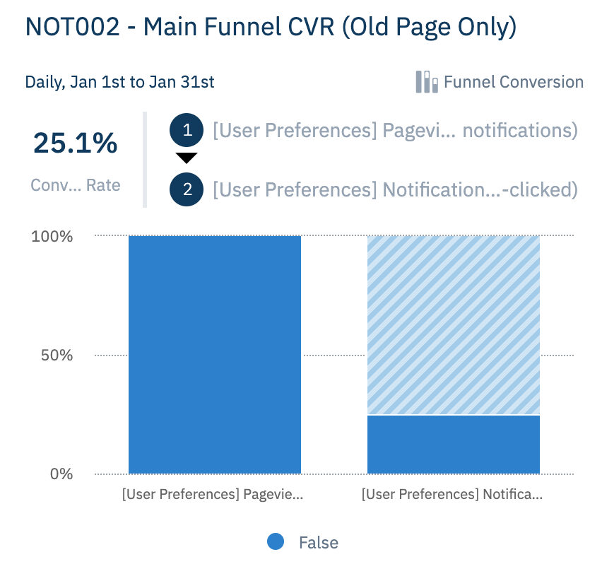
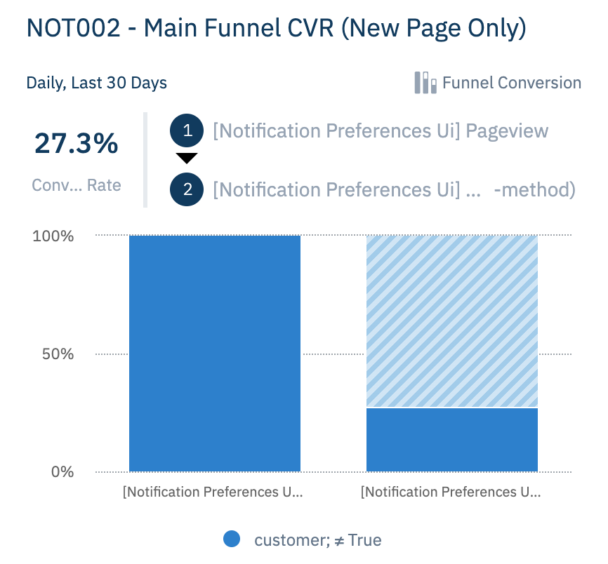
The data in Amplitude told us that the old page had a conversion rate of 24.9%. Our goal was to improve on that original percentage.
We used an internal tool designed for product experiments to help us decide how long the experiment should run. Taking into account several factors such as the daily traffic for that page, the fact that we wanted to have 95% significance, and that we were aiming for at least a 1% increase in the conversion rate, we set an experiment duration of at least 14 days.
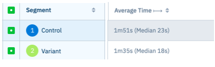
After 14 days, the results were conclusive: the new designs had a higher conversion rate and the time to convert was shorter.
Here are the results we’re seeing so far:
Qualitative data:
Quantitative data:

Of course, there is still a lot of work to be done to improve this page and it will be an ongoing iterative process based on the feedback we get as well as the data we see on Amplitude. But for now, we’re pleased to have made the process of setting notification preferences smoother for our customers. Helping them focus on the right things to be more productive and get better results is always our goal.
Want to work for a team that's committed to solving for the customer? Check out our open positions and apply.