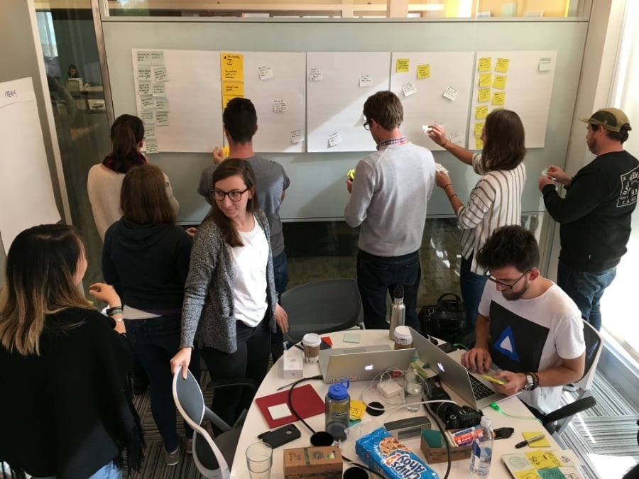
 What do you get when you mix a 484-piece classic Lego set, approximately 100 gallons of caffeine, 2000 stickers, sharpies galore, and enough Post-its to wallpaper an entire house?
A HubSpot design workshop, of course.
There’s nothing more inspiring than knowing that design can make a dent in the universe. Making an impact, though, requires taking a step back every now and then to recognize our challenges, identify where we need to improve, and find opportunities to become stronger designers. That's why, last month, our product design team assembled at Workbar in Cambridge for a 2-day workshop. Our goals were to critically examine the current state of product design at HubSpot, develop a new design mission, and come up with measurable ways to reach that vision.
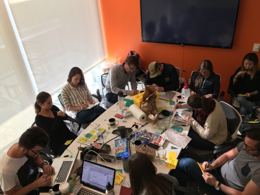
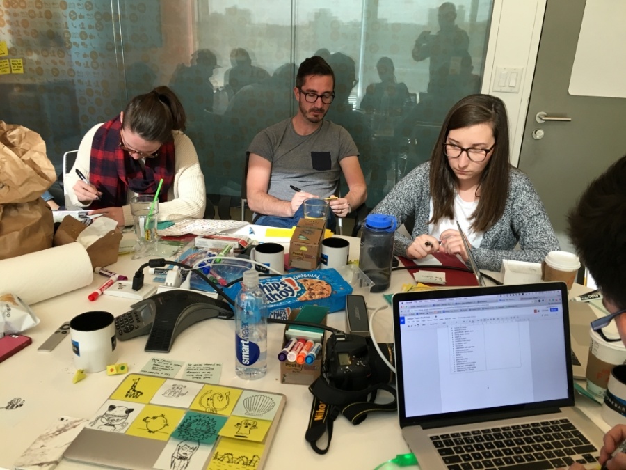
Getting A Lesson in Vulnerability
Fresh out of INBOUND, Brene Brown’s keynote really resonated with us, especially when she said: “Vulnerability is the birthplace of innovation, creativity and change.” If we were going to pick apart our current state of design and find areas of opportunity, we would have to be vulnerable and honest with each other, and with ourselves.
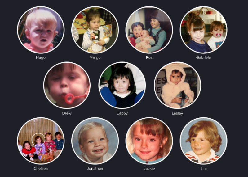
That’s why we started the workshop with a series of group exercises. On the highest level, we shared baby photos with each other and laughed while trying to guess who each person was. On the deepest level, we shared our lives with each other, drawing maps of some of our happiest and most challenging moments.
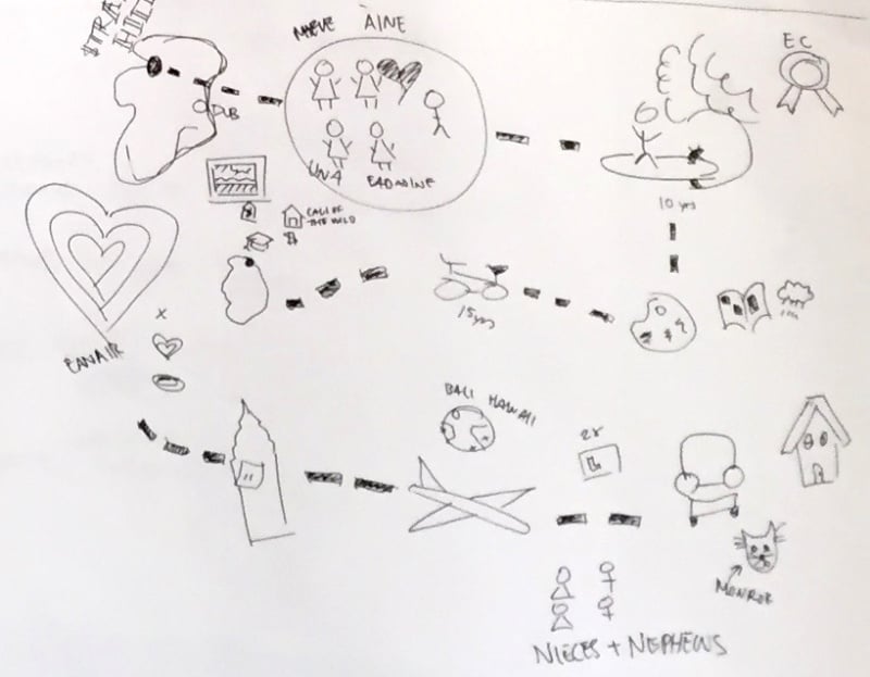
I realize how “kumbaya” this sounds (I swear we didn’t do trust falls), but these exercises really helped us break out of our shells, bond, and in the end, foster a culture of trust which is necessary when sharing our ideas and for giving and receiving critiques. It wasn’t until we were vulnerable together that we could talk critically and openly about our own product design process and its flaws.
Analyzing Our Current State of Design
At its core, development at HubSpot is rooted in autonomy. Each product designer works on and owns the overall user experience of a part of the product. We’re embedded on small, autonomous teams typically containing a product manager, tech lead, and a few engineers. Together, each team is responsible for the direction of their product.
While autonomy can give us blue skies to innovate and the ability to ship quickly, it’s not without its challenges. Each designer’s process and how they work with their team is different. Couple that with having the responsibility to maintain older features while building new ones that push our product forward, and inconsistent experiences naturally occur. Sometimes to compensate for moving at such a rapid pace, one-off components would be created which over time served to slow everything down and make the product more disjointed.
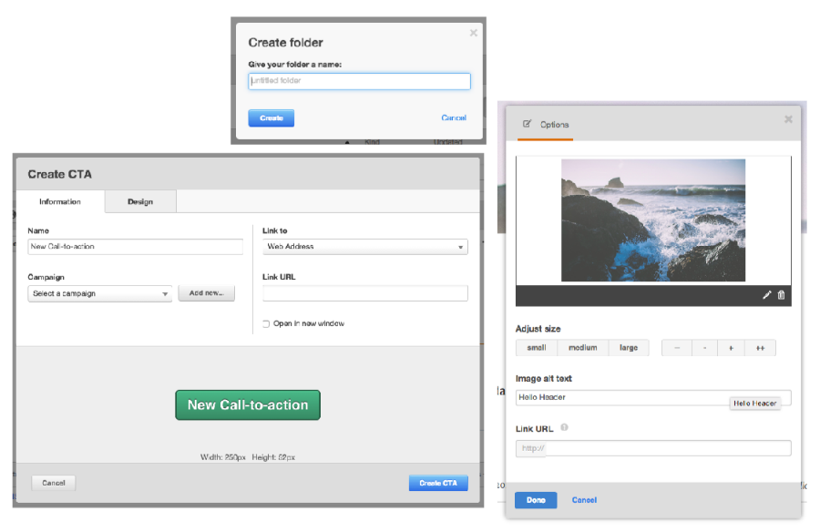
Just three examples of various iterations on modal window styles in our product over the years.
Knowing this, we pinpointed over 36 tangible areas for improvement by the end of day one. They ranged from things as high-level as “lacking design principles,” to things as nitpicky as our “usage of colors” in the app. From that long list, we voted and pulled out five overarching areas to improve on that we would focus on first:
- We need defined UX methodologies to follow and to teach.
- We need a unified style guide and pattern library.
- We need design principles to guide our decision-making.
- We need to update our UI.
- We need to be less risk-averse.
Crafting Alignment, One Post-it Note at a Time
After analyzing our inconsistencies and variation across design processes and styles, we realized how big of a weakness it is that we don’t have a clearly defined set of design principles. The HubSpot Culture Code guides our company and how each of us approaches our work every day. As individuals, we’re already good at using that deck to inspire us to solve for the customer and work autonomously to make an impact. But as a design team, we are still missing a unified set of values and motivations.
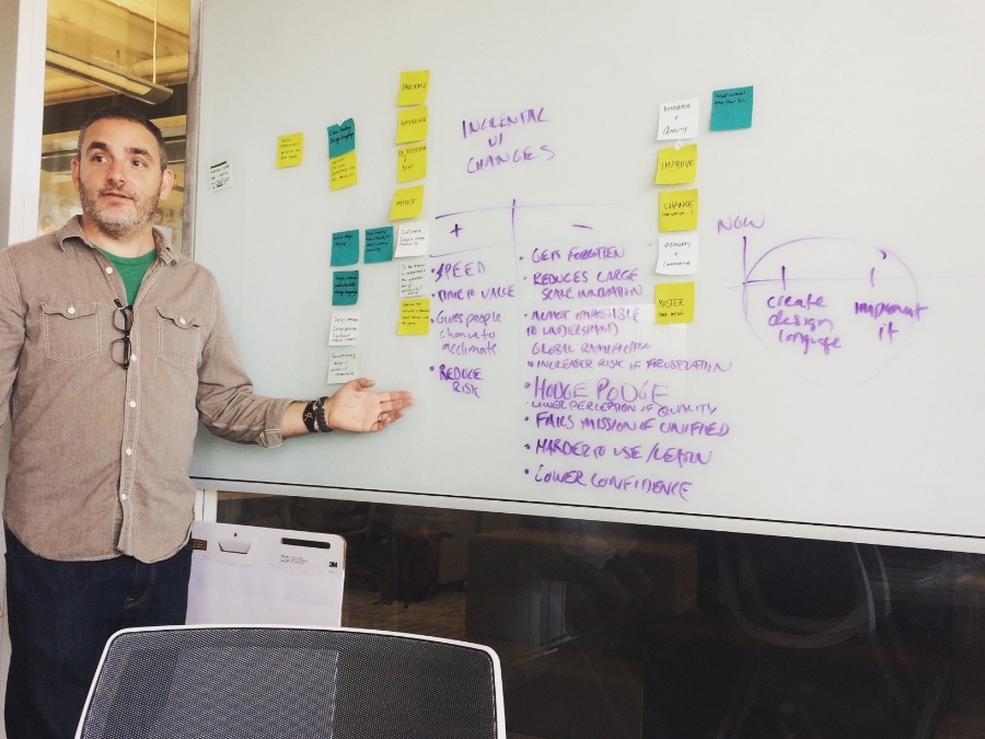
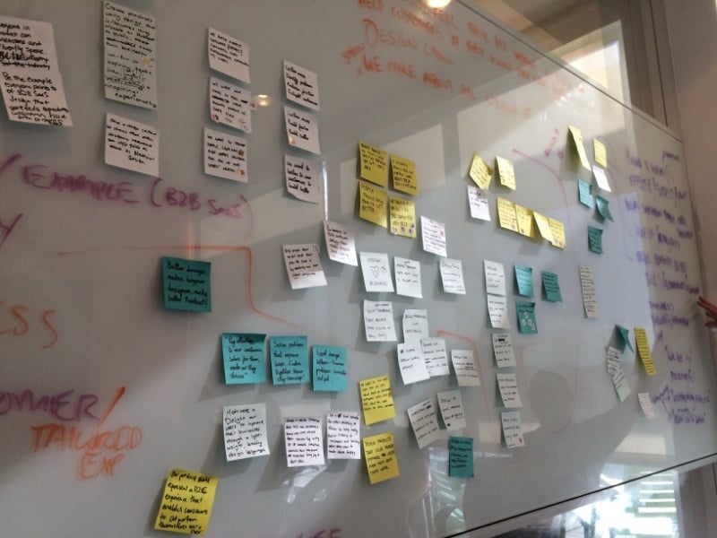
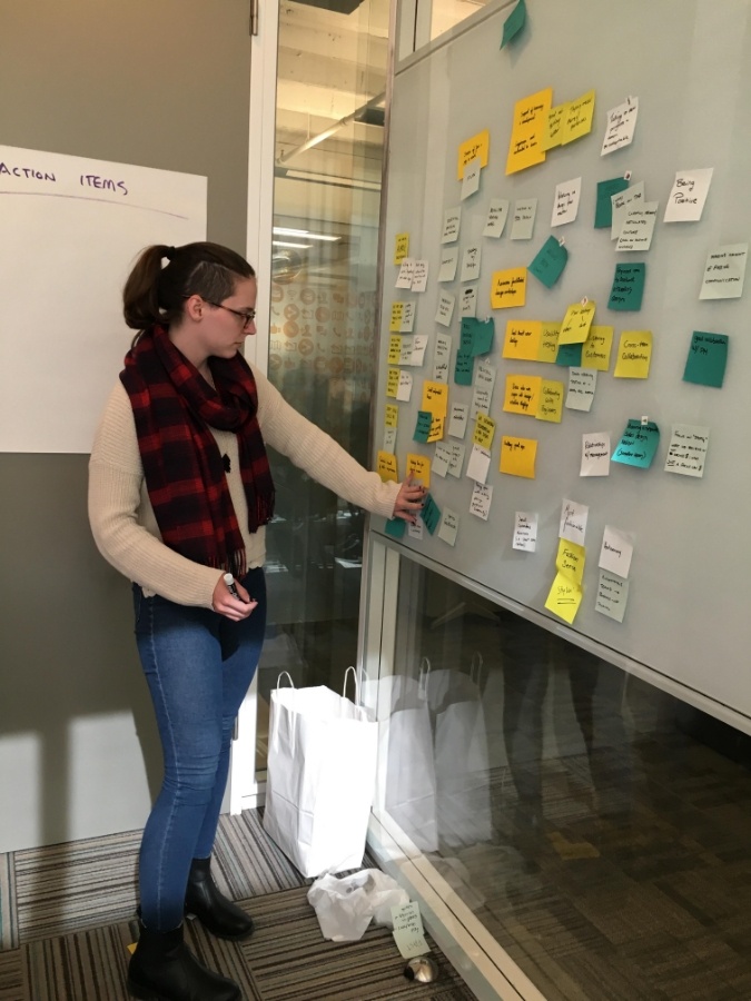
We set out to define both our team mission and our vision for what we hoped to become in the next year. As simple as it sounds to come up with two sentences, it was a rigorous process. We spent a few hours individually coming up with phrases that might work in our mission statement, sharing our ideas, grouping our ideas into overarching categories, and then reiterating. Rinse and repeat. We kept at it until we found ourselves converging on the same few phrases and words.
Mission:
- Human
- Authentic
- We empower others
- Personal satisfaction through work satisfaction
- Helpful
Vision:
- Infectious design culture
- Accessible design language
- Design methodology
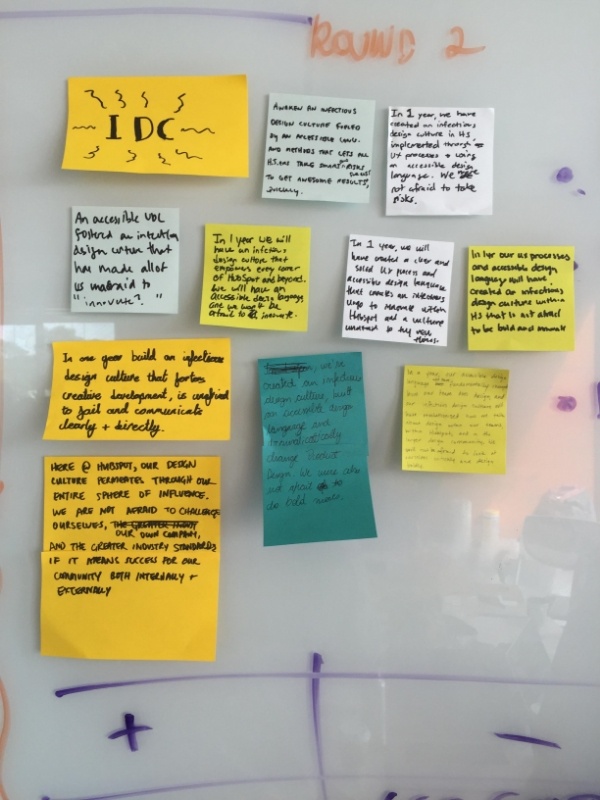
These are just a few of the values and aspirations we came up with, and we’re now using them as a blueprint for building a mission statement and vision that is actionable, concrete, and shareable.
Work Hard, Play Hard
A 2-day workshop in one room can be physically, mentally, and emotionally draining. We knew each other’s life stories, we ripped apart our design processes and exposed every issue and weakness, and we had taken the first steps towards building an improved team. But in true HubSpot fashion, we also made time to have fun, let loose, and get creative.
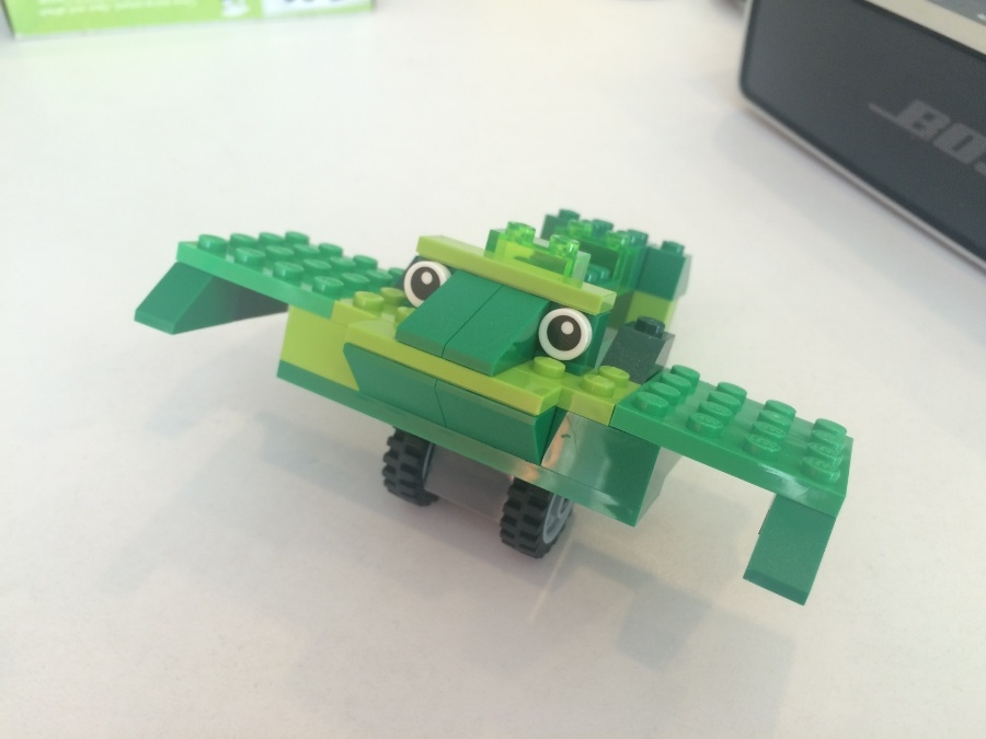
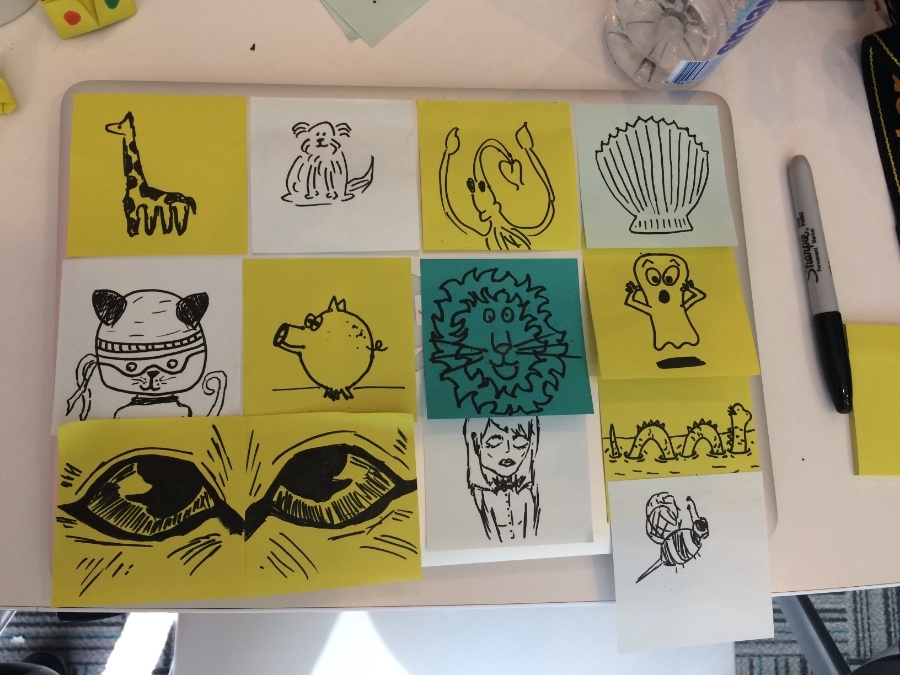
We made flying frog figurines of Legos and covered a laptop in post-its of animal doodles.
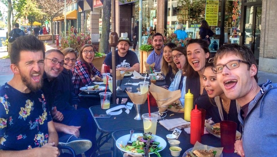
We practiced making the exact same funny faces.
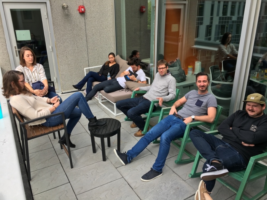
We refined our art of chill.
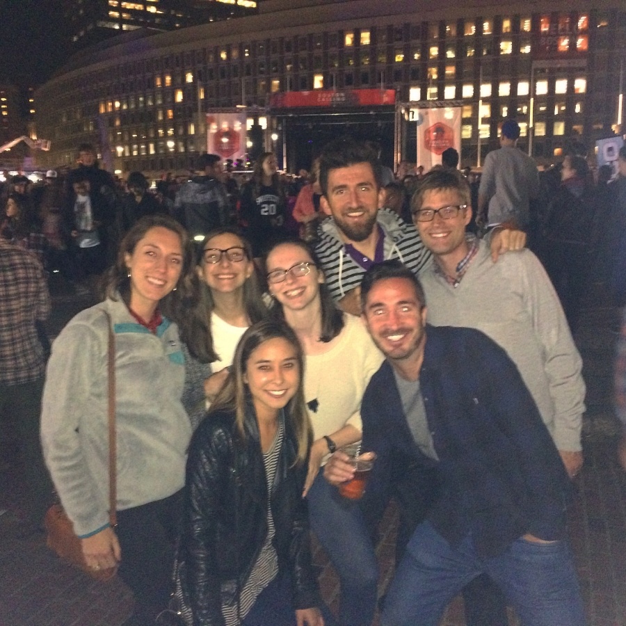
We listened to fellow senior designer Jonathan Meharry’s hilarious accents and impressions, and to Of Monsters and Men at Boston Calling.
Team building and brainstorming can sometimes seem trivial in a fast-paced development environment. We were worried at first that a 2-day workshop might slow us down. The reality is, taking time to recognize our weaknesses and areas of improvement is going to save us time, and more importantly, customer pain, in the long run. Getting out of our comfort zones and doing something completely different and reflective created a new, shared perspective on our approach to product design. We’re now in the thick of crystallizing our mission and vision, coming up with a game-plan for tackling the top areas of improvement, and creating effective methods for measuring our solutions. This workshop was only the beginning of the work we have ahead, so stay tuned for more updates as we build a smarter and more effective approach to product design.
