By the people, for the people: Keeping your design system evergreen
This post is the third in a series about HubSpot Canvas, our new Design Language. Read the first here and the second here. Every January, millions of ...
This post is the first in a series about HubSpot Canvas, our new Design Language.
There’s an old comedy skit about a mailman who decides he’s no longer passionate about delivering mail - he’d rather deliver tacos instead.
In the skit, a man waits by his mailbox to confront the mailman about the lack of actual mail in his mailbox. Despite loving tacos, the resident says, “If I had to choose between the tacos and the mail, I’d have to choose the mail.”
Tacos are much more exciting than bills, but the man doesn’t need tacos. He needs his mail.
HubSpot customers need a product that’s consistent, highly functional and delightful. So the HubSpot Design team needed to create a design system that would help us fullfil those needs on a continual basis.Over the last couple of years, we’ve:
In order to accomplish all this, we needed to invest in our talent. We’ve scaled our UX team from 14 product designers, 2 researchers, and 1 writer to more than 34 product designers, 8 researchers, 3 writers, and 1 product illustrator (and we’re still hiring).

This is the story of how we committed to delivering the mail (while still managing to sneak some tacos in, too).
We needed to redesign the HubSpot platform for two reasons. First, to do a better job on delivering the promise of our brand. Our customers love the HubSpot brand. It’s fun, vibrant, and full of personality. But the product, well, wasn’t. It just didn’t reflect the energy our customers were putting into growing their businesses.
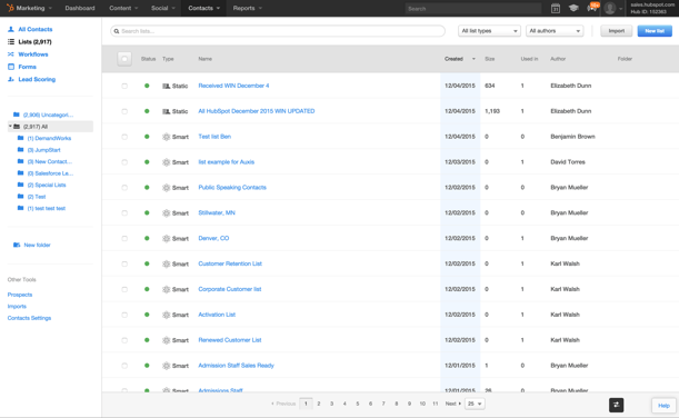
Second, to eliminate the inconsistencies that had crept into our UI. Our interface had inconsistencies across the platform, which made it harder to use and navigate the tool. Take these two modals in the Marketing Hub as an example:
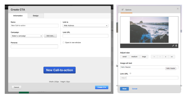
Notice the inconsistencies in button placement, tab design, and interaction patterns? These inconsistencies increased the cognitive load on our customers, making it difficult for them to perform simple actions like saving their work or closing a dialog, which ultimately slowed them every day.
So we decided to start by gathering user feedback about our current design. The feedback wasn’t pretty, but it was valuable:
“Seems more complex than it needs to be.”
“Too many options. My eye isn’t drawn anywhere specifically.”
“Dense and busy. No white space.”
“The color combinations are out of date and not pleasing.”
“Too much grey and everything seems to be tucked away in it’s own little box.”
“Uninteresting.”
We knew we needed a complete refocus and rededication to the customers we serve — to their personalities, quirks, motivations, aspirations, and even (or especially) their anxieties. Ultimately, we wanted to craft a new design for our product that would be as delightful and easy to use as any of the consumer apps our customers used every day.
But with that came the realization of a universal truth:
Redesigning our platform meant we would need to disrupt 40 product teams across two continents. It meant we would need to divert some design and engineering resources away from creating new experiences so we could fix existing ones. And during the rollout, it meant our support and services teams and our customers would need to continuously adapt to ongoing product changes.
We started this process knowing that we weren’t setting out to redesign just our product — we needed to entirely rethink the way we designed and built products.
We needed to understand what inefficiencies in our organizational structure and workflows had led us to create a fragmented user experience in the first place, and replace them with practices and systems that worked.
So the first part of this story focuses on how we identified those challenges, how we approached the redesign of our product, and the tools we’ve created to empower our design team to be as consistent, efficient, and autonomous as possible.
Last year, my parents decided to sell my childhood home. I was roped into helping them clean out the attic — an attic that has accumulated twenty years’ worth of stuff. As you can imagine, there were a lot of WTF moments during that cleaning session. Some moments were along the lines of: WTF: We saved this thing!? Cool! But most were more like: WTF: Why do we still have 87 Beanie Babies?
Well, in much the same way, our design team first needed to audit every component that was ever imagined, coded, and shipped into production over the previous ten years at HubSpot. We needed to get down to this granular level to better understand what the current product experience was. Every designer was asked to go through their respective apps and find every component, take a screenshot, name it, and file it away for review.
Pop quiz: How many date pickers is too many?
Three? Maybe four?
Well, we had eight.
Here are some of the other things we found in our attic:
Here’s a visual of all the buttons that existed in the HubSpot platform at the same time:
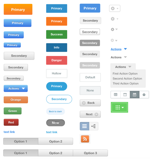
So how did this happen? How did we end up with so many buttons? How did we end up with so many date pickers?
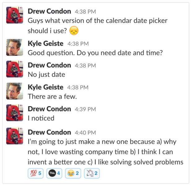
Here’s an actual Slack conversation from those old, darker days:
Putting the sass back in SaaS
The truth is, no designer or developer at HubSpot really wants to spend their time reimagining the date picker.
We identified that the reason teams had created so many variations of essentially the same styles and components was because our organizational structure created visibility issues. In short, it was very hard to discover what was already in play, and easier to just build something new.
The HubSpot product team consists of small, autonomous teams that are structured around solving for specific customer needs. This allows us to move quickly as a product development organization and be highly responsive to our customers’ changing needs. But it also presents challenges when it comes to keeping different product teams aligned.
When you have 40+ product teams rapidly building, shipping, and iterating, it’s actually pretty easy to lose sight of the overall customer experience. Being tightly focused on a specific problem often means you’re putting on blinders to everything else. Because of these blinders, our designers and developers were unknowingly recreating existing elements, components, and patterns across our user interface. This led to a fragmented user experience and compounded design and tech debt.
Our small, autonomous team structure isn’t going to change — it’s part of our DNA. So it was clear that we needed to put more effort into creating tools and systems to better align our product teams. By connecting everyone to one centralized design system, we could ensure that we’d have a unified user experience even as we continued to grow.
This would free our designers and developers from obsessing over pixels so they could spend more time obsessing over people.
The audit helped us identify problems in our design process and understand what aspects of our development culture had created inefficiencies. But before the mood boards could be created, before the typography could be explored, before we could have heated discussions over the perfect hue of orange, we needed to get principled.
We needed to agree on our core beliefs, the ones we could lean on when decisions were hard. And we needed to uncover which ideals our teams felt the responsibility to uphold.
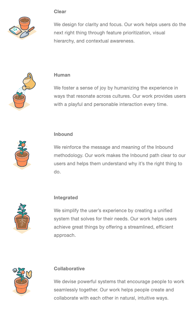
So the design team ran a few ideation exercises to establish the foundation of our new design language. We debated, we stack-ranked, and we landed on five core design principles, ones that have guided us through a million micro- and macro-design decisions since. These principles are:
Our design team ran a few sessions to redesign some of the core screens in our product, then elected a group of four product designers to spend a full, uninterrupted week ideating, designing, and ultimately testing a few different visual directions with our customers. These sessions produced some wildly different design directions that felt really new and exciting.
Here’s a taste of some very early design concepts from two members of the design language team, Drew Condon and Jackie Barcamonte:
Wild, right? Different. Exciting. Definitely not boring, stiff “business software.”
The design language team ultimately tested three different design directions with our customers through multiple rounds of surveys and interviews. Once we heard the following statements, we knew we’d found a winning direction:
“Makes me feel productive.”
“I feel capable. I feel like I know exactly what to do.”
“This is fun. This is what I would expect from HubSpot.”
“Next generation of web.” (someone actually said that)
“Doesn’t look like business software.”
“Makes me feel in control.”
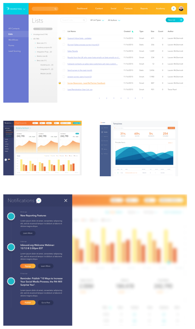
Here’s a peek into the evolution of the design direction that was preferred most by the customers we interviewed:
Once we validated our design direction with actual users, it was time to apply that visual style to all of our core UI components. And I’m talking about hundreds of components: buttons, links, selects, tables, breadcrumbs, modals, inputs, popovers (the list goes on). This is where the redesign got a lot less fun and a lot more meticulous and exhausting.
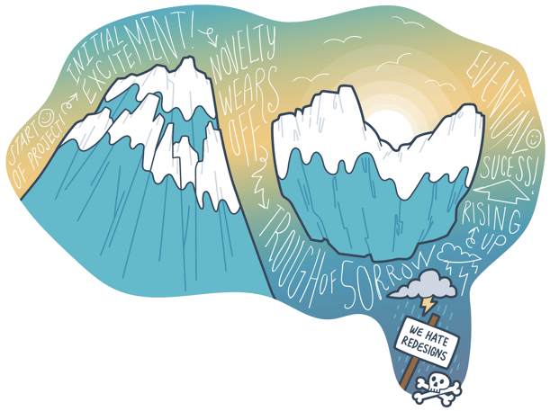
But that meticulous, exhausting work was a long-term investment in our company and our customers. I remember one Friday afternoon that the design language team and I spent in a two-hour long meeting. We were in the trough of sorrow.
Our job that day was to decide on the margin and padding of some of our most atomic components (buttons, controls, inputs, etc.) — the building blocks of our user interface.
There were five of us in that meeting and we spent probably fifteen minutes carefully considering the margin of all our new buttons. This means that HubSpot was paying the salaries of five designers to sit in a room and debate something as mundane as the space that surrounds text in a box.
But.
Not one of our front-end engineers, product designers, researchers, writers, or product illustrators has needed to think about the margin of a button since that decision was made two years ago.
That’s the beauty of building a design system. By deciding on a detail once, you free up your entire product development team to focus on solving actual customer problems.
We put all of our shiny new components, as well as some guidance on how to use them, into Sketch (our design tool of choice). This created an immediate explosion in our team’s productivity, while also (suddenly) keeping our design work closely aligned.
Before this process started, we didn’t have one centralized place designers could go to understand which elements or components already existed, and no place where they could go if they wanted to use those elements or components in their own work. Designers and developers were trying their best to make good decisions about which components or patterns to use, but their main reference point was the existing product — which was decidedly inconsistent.
To combat inconsistencies (while speeding up our workflow) we built a robust style and component library for our new design language. This thirty-page Sketch file is organized by “component families” and houses every single element or component that comprises our products user interface. It’s updated weekly and is shepherded by a small, rotating task force of product designers and a dedicated front-end development team.
Need an icon? Come right this way.
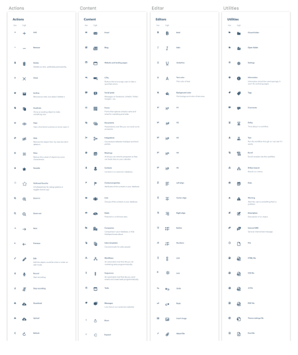
Icons by Josh Mulvey, Sue Yee, and Chelsea Bathurst
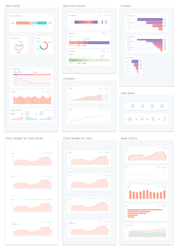
Need data visualization? You got it.
Need a button? As you wish.
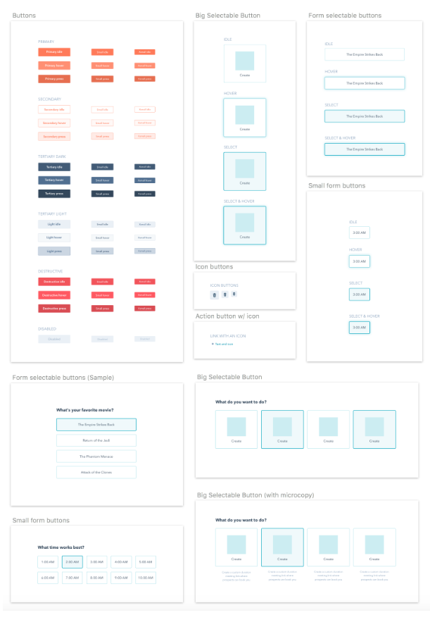
There's only one primary button this time around. It's orange. We like the color orange.
Need literally anything else? HubSpot Canvas has you covered.
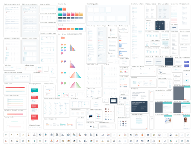
All components are shown here on one page for dramatic effect
Each component that exists in the Sketch kit also exists as a React component, making it easy to translate any mockup into a code the same way you assemble legos.
That means our designers don’t spend their days pushing pixels, drawing up spec sheets, or worrying about the responsiveness of their layouts. It means our developers don’t spend hours tweaking custom CSS (in fact, they write almost none at all).
It means our developers spend more time building. And it means our designers spend more time researching, ideating, and iterating, quickly and in high fidelity.
Here’s a peek at the average HubSpot designer’s workflow, using Sketch libraries and the Runner and Craft (by Invision) plugins.
And to keep pace with the HubSpot product, our component library continues to grow and evolve. It’s maintained by a core group of designers and developers, but everyone on the product team contributes and weighs in. Whenever a new component is built or improved, it’s rolled back into the Sketch library and is accessible to all. This vastly reduces the number of rogue components or duplicate components.
Our Sketch kit is just one piece of a larger design system. In order for it to be truly effective in the long term, we needed to create tools that worked just as effectively for developers. We learned that the best way to create consistent, functional, and delightful product experiences is to make the lives of those who build those experiences much easier.
In the next several posts we’ll share how we tightened the relationship between designers and developers through the construction of our UI Library and the processes we’ve put in place to streamline the ongoing expansion and maintenance of our design system.
In closing:
People over pixels.
Mail over tacos.
Tacos are delicious.
But people need their mail.
Credits:
Illustrations by Sue Yee
Resources we found helpful:
Atomic Design by Brad Frost
Designing The Perfect Date And Time Picker by Vitaly Friedman
Finding the Right Color Palettes for Data Visualizations by Samantha Zhang